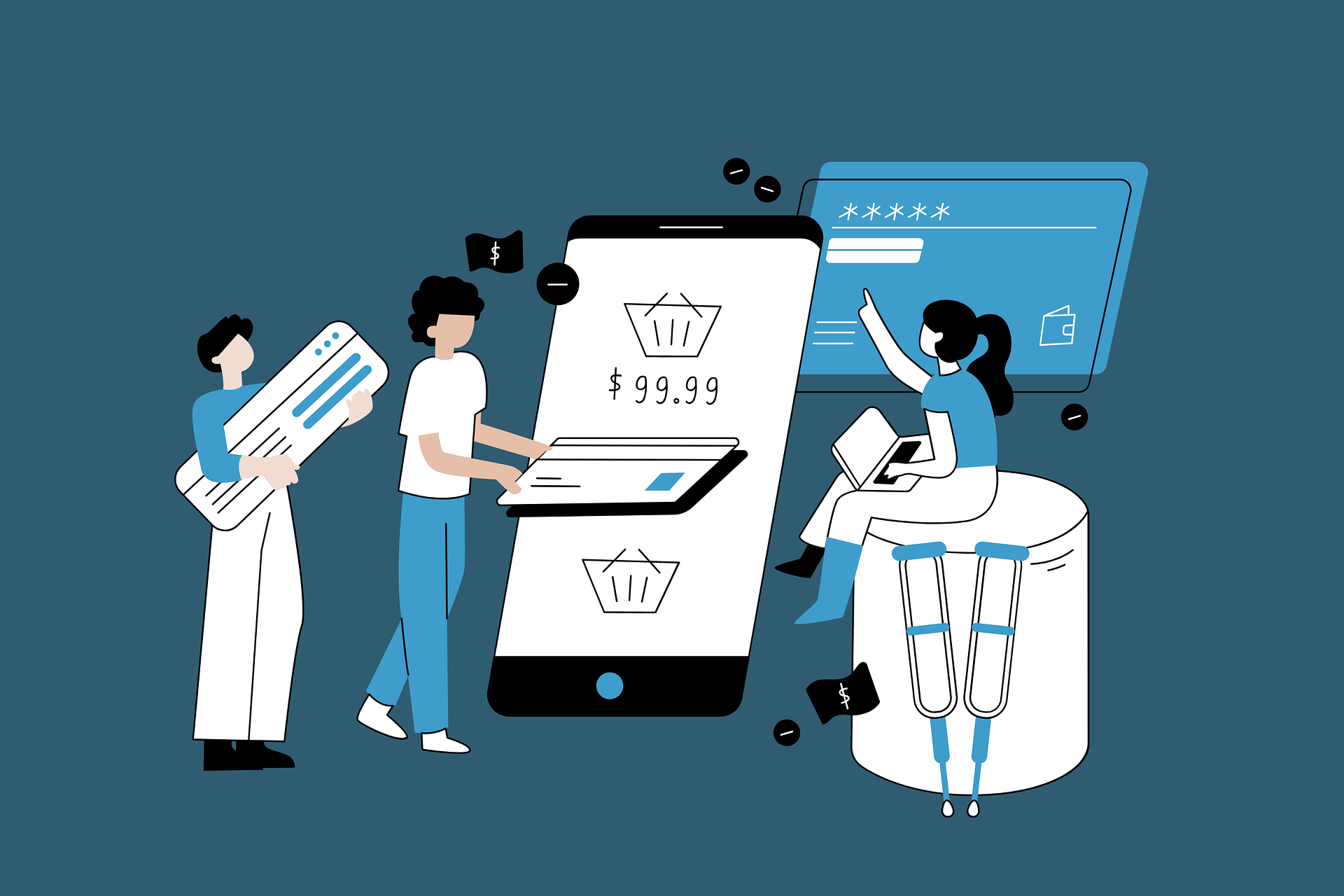
Most Shopify product pages don’t fail because of bad products. They fail because of friction, weak messaging, and missed trust signals.
When visitors hesitate, conversions drop. And when conversions drop, every marketing dollar becomes less efficient.
A small lift in product page conversion rate can outperform months of traffic growth.
If your page converts at 1% instead of 2%, you are effectively cutting your revenue potential in half. That gap compounds fast.
This checklist breaks down the exact elements that move buying decisions: clarity above the fold, stronger proof, better structure, and reduced risk.
No theory. Just practical fixes you can apply immediately.
If you run a new Shopify store, this will help you build your pages correctly from the start.
If you already have traffic but sales feel inconsistent, this will show you where performance is leaking.
Ready to optimize your store? Explore the full Shopify product page optimization guide here for a detailed walkthrough.
Why Product Page CRO Matters More Than Traffic
Traffic feels productive because you can see it in your dashboard, but traffic without conversion is just noise.
More visitors do not fix a weak product page; they amplify its inefficiencies.
If your page does not clearly communicate value, reduce doubt, and guide the buying decision, increasing traffic simply sends more people into the same leak.
Conversion rate optimization works differently. It improves the performance of traffic you already paid for or worked to earn.
The math is straightforward. If 10,000 visitors convert at 1%, you generate 100 orders. Increase that to 2%, and you generate 200 orders from the same traffic.
That is a 100% revenue lift without spending an extra dollar on ads. Even a move from 1.5% to 2% can dramatically increase profit because acquisition costs stay fixed while revenue scales.
Product pages are the core driver of this outcome because they are where buying decisions are made.
Your homepage attracts attention, your ads create interest, but your product page closes the sale. If it lacks clarity, proof, or risk reduction, the entire store’s conversion rate drops.
Improve the product page, and the impact flows upward: higher add-to-cart rate, stronger checkout completion, better return on ad spend, and more stable growth.
When performance is inconsistent, the product page is usually the bottleneck. Fix that first, then scale traffic with confidence.
Above-the-Fold Optimization Checklist
1. Clear, Benefit-Driven Product Title
- State what the product is in plain language.
- Lead with the primary outcome or core benefit.
- Remove unnecessary adjectives and filler words.
- Avoid keyword stuffing that weakens clarity.
- Keep it instantly understandable at a glance.
2. High-Quality Product Images
- Use 4–6 high-resolution images minimum.
- Show multiple angles to remove uncertainty.
- Include zoom functionality for detail inspection.
- Add lifestyle images to show real-world use.
- Maintain a clean, consistent background.
- Ensure fast loading without reducing clarity.
3. Compelling Product Description (Short Version First)
- Start with 3–5 strong benefit-driven bullet points.
- Focus on outcomes, not just features.
- Answer “Why should I care?” immediately.
- Keep sentences tight and direct.
- Use spacing and formatting for easy scanning.
- Expand into deeper details below the fold.
4. Strong Primary CTA Button
- Use clear action wording like “Add to Cart.”
- Avoid vague phrases that reduce intent.
- Make the button visually dominant.
- Use high contrast against the background.
- Ensure it is visible without scrolling.
- Add a sticky CTA on mobile if possible.
5. Price Clarity
- Display the full price clearly and prominently.
- Show original price with a strike-through if discounted.
- Highlight savings percentage when applicable.
- Avoid hidden fees revealed at checkout.
- Reinforce value near the price (guarantee or shipping note).
Trust-Building Elements Checklist
6. Product Reviews & Ratings
- Display star ratings directly under the product title.
- Show total review count to signal credibility.
- Place a review summary above the fold.
- Include photo reviews to increase authenticity.
- Highlight detailed reviews that mention results.
- Aim for at least 15–20 reviews for baseline trust.
- Continue collecting reviews consistently over time.
7. Trust Badges & Payment Icons
- Show secure checkout indicators near the CTA.
- Display SSL/security reassurance clearly but subtly.
- Add recognizable payment method icons.
- Place trust badges close to high-friction areas.
- Avoid cluttering the design with excessive badges.
- Reinforce safety without overwhelming the page.
8. Shipping & Return Transparency
- Clearly state estimated delivery times.
- Mention shipping costs upfront.
- Highlight free shipping thresholds if applicable.
- Present your return policy in simple language.
- Emphasize hassle-free or easy returns.
- Eliminate unexpected fees at checkout.
9. Social Proof & UGC
- Feature real customer photos on the product page.
- Add short testimonials with specific outcomes.
- Include user-generated content where possible.
- Show usage videos to reduce uncertainty.
- Highlight transformations or before-and-after examples.
- Keep proof visible near decision points.
Persuasive Product Description Checklist
10. Problem → Solution Framework
- Open by clearly naming the core pain point.
- Use language your customer actually thinks in.
- Show you understand the frustration or limitation.
- Present the product as a direct solution, not a generic option.
- Explain how it removes the specific problem.
- Describe the before-and-after transformation.
- Keep the focus on the customer’s improved outcome.
11. Benefit-Driven Bullets
- Lead with outcomes customers care about most.
- Translate every feature into a real-world benefit.
- Remove technical details that do not drive decisions.
- Keep bullets short and easy to scan.
- Prioritize clarity over clever wording.
- Reinforce value tied to price and positioning.
12. Objection Handling
- Identify the top 3–5 common buying doubts.
- Address concerns about quality, sizing, fit, or durability.
- Clarify shipping times and return conditions again if needed.
- Reduce risk with guarantees or satisfaction promises.
- Add a concise FAQ section directly on the product page.
- Answer questions before customers leave to “think about it.”
UX & Technical Optimization Checklist
13. Mobile Optimization
- Design for mobile first, not desktop reduced to fit.
- Keep layout vertical, clean, and distraction-free.
- Ensure buttons are thumb-friendly and easy to tap.
- Increase spacing between clickable elements.
- Use a sticky add-to-cart button on mobile.
- Keep key information visible without excessive scrolling.
- Eliminate popups that block early decision flow.
- Test checkout flow on real devices, not just preview mode.
14. Page Speed Improvements
- Compress all product images before uploading.
- Use modern image formats where supported.
- Remove unused apps that inject heavy scripts.
- Limit third-party tracking tools to essentials only.
- Clean up theme code and remove unused sections.
- Avoid auto-playing videos above the fold.
- Aim for fast load times on 4G, not just Wi-Fi.
15. Clear Variant Selection
- Make size and color options instantly visible.
- Use clear labels instead of vague dropdown text.
- Replace dropdowns with buttons or swatches where possible.
- Display visual color swatches instead of text-only names.
- Show selected variant clearly before checkout.
- Indicate out-of-stock variants without hiding them.
- Prevent customers from adding unavailable combinations.
Conversion Boosters
16. Urgency & Scarcity (Used Carefully)
- Use low stock indicators only when inventory is genuinely limited.
- Display exact quantities (“Only 3 left”) instead of vague warnings.
- Avoid fake countdown timers that damage trust.
- Apply limited-time offers with a clear deadline.
- Tie urgency to real events (seasonal sale, product drop).
- Keep urgency visible near the CTA, not buried in text.
- Monitor performance to ensure it increases action, not skepticism.
17. Bundles & Upsells
- Offer “Frequently Bought Together” directly below the main product.
- Recommend complementary items that increase product effectiveness.
- Keep bundle pricing simple and clearly discounted.
- Use quantity discounts to increase average order value.
- Show savings clearly when customers add more units.
- Avoid overwhelming buyers with too many upsell options.
- Prioritize relevance over aggressive cross-selling.
18. Risk Reversal
- Offer a clear money-back guarantee.
- State the guarantee period visibly (e.g., 30 days).
- Explain the refund process in simple steps.
- Emphasize satisfaction guarantees near the CTA.
- Remove hidden conditions that weaken credibility.
- Reinforce that the customer carries minimal risk.
- Position guarantees as confidence in product quality, not a sales tactic.
Advanced CRO Elements (Optional but Powerful)
19. Video Demonstrations
- Place a short product demo near the main image gallery.
- Show the product in real use, not staged animation.
- Focus on solving the core problem visually.
- Keep videos under 60–90 seconds for retention.
- Add captions for sound-off viewing on mobile.
- Include before-and-after results when transformation matters.
- Highlight key benefits within the first 10 seconds.
- Avoid autoplay with sound that disrupts user flow.
20. Comparison Tables
- Add a clean comparison table below the main description.
- Compare product variants side by side for clarity.
- Highlight differences in features, size, or performance.
- Use checkmarks and simple labels for fast scanning.
- Include competitor comparisons where strategically useful.
- Emphasize unique advantages without exaggeration.
- Keep the design minimal to avoid cognitive overload.
21. Personalization Elements
- Display recently viewed products to reduce backtracking friction.
- Add dynamic recommendations based on browsing behavior.
- Suggest complementary items aligned with purchase intent.
- Prioritize relevance over random product exposure.
- Avoid excessive recommendation blocks that distract.
- Keep personalization subtle and performance-focused.
- Track engagement to confirm impact on conversion rate.
Common Product Page CRO Mistakes
Overcrowded Layout
A crowded product page increases cognitive load and delays decisions.
When too many elements compete for attention—badges, popups, banners, countdowns, sliders—clarity disappears. The buyer should never have to search for the next step.
Every extra visual element must justify its presence by improving understanding or reducing friction. If it does neither, remove it. White space is not empty space; it guides focus.
Prioritize hierarchy: product title, images, price, benefits, CTA. Everything else supports those elements.
When the layout becomes noisy, conversion drops because decision confidence weakens.
Too Much Text
Length is not the problem. Density is. Large blocks of unstructured text reduce scanning and overwhelm the reader. Most buyers skim before they commit to reading.
If key benefits are buried in paragraphs, they are invisible. Break information into short sections, bullets, and clear subheadings. Lead with outcomes.
Remove repeated claims and filler language. A product page should answer questions efficiently, not feel like an essay.
Depth belongs below the fold, structured for optional reading. Clarity above the fold drives action.
Weak Product Photography
Low-quality images create immediate doubt. Blurry photos, inconsistent lighting, or generic supplier images reduce perceived value.
If customers cannot clearly see the product, they assume risk. Strong photography reduces uncertainty before objections form. Show texture, scale, and real-world use.
Include close-ups where detail matters. Maintain consistent background and lighting to signal professionalism. Images are not decorative.
They replace the physical experience of holding the product. When visuals fail, conversion suffers first.
Hiding Key Information
Critical details such as shipping times, return policies, sizing guides, or materials should never be difficult to find.
When customers cannot locate answers quickly, they leave to “research more.” Most do not return. Place high-friction information near decision points.
Reinforce shipping clarity near the price or CTA. Make returns simple and visible. Display guarantees confidently. Transparency accelerates decisions. Hidden details create hesitation.
Ignoring Mobile Users
Mobile traffic often represents the majority of sessions, yet many product pages are designed for desktop first. Small buttons, cramped text, and slow loading destroy intent quickly.
On mobile, patience is lower, and distractions are higher. Simplify layout. Use larger tap targets. Keep primary information within thumb reach.
Ensure fast load times on standard mobile networks. Test the full purchase journey on an actual device.
If mobile performance is weak, overall store conversion will remain capped regardless of desktop optimization.
How to Audit Your Shopify Product Page (Step-by-Step)
A product page audit should be structured and time-bound. You are not browsing your store. You are diagnosing friction. Start fast. Then go deeper.
🔎 5-Minute Quick Audit (Surface-Level Friction Check)
This identifies obvious leaks that suppress conversions immediately.
Step 1: Above-the-Fold Clarity
- Is the product title clear and benefit-driven?
- Is the price visible without scrolling?
- Is the primary CTA obvious and high contrast?
- Are star ratings visible near the title?
Step 2: Visual Confidence
- Are the images high resolution?
- Can users zoom in?
- Are there at least 4–6 product visuals?
- Is there at least one real-world or lifestyle image?
Step 3: Trust Signals
- Are reviews visible?
- Is shipping information easy to find?
- Is there a visible return or guarantee statement?
If you hesitate answering any of these, your customers hesitate too.
🔬 30-Minute Deep Audit (Conversion System Review)
This evaluates structure, persuasion, and technical performance.
1. Messaging & Positioning
- Does the description clearly state the problem and outcome?
- Are benefits stronger than features?
- Are objections handled directly?
- Is there structured formatting for scanning?
2. Behavioral Flow
- Is the CTA repeated at logical intervals?
- Is there a sticky add-to-cart on mobile?
- Are upsells relevant and non-intrusive?
- Are urgency elements authentic?
3. Technical Performance
- Page load speed on mobile (test on 4G).
- Image compression status.
- Unnecessary third-party apps/scripts.
- Variant selection clarity and error prevention.
4. Data Review
- Product page conversion rate.
- Add-to-cart rate.
- Scroll depth (if tracked).
- Mobile vs desktop performance gap.
You are looking for friction patterns, not isolated issues.
⚡ What to Fix First for Fastest Results
Prioritize changes that impact buying confidence immediately:
- Improve above-the-fold clarity (title, price, CTA, reviews).
- Strengthen product images.
- Add or improve trust elements (reviews, guarantees, shipping clarity).
- Fix mobile usability issues.
Final Thoughts
Product page CRO is not a one-time redesign. It is an ongoing performance process.
Markets shift, traffic sources change, and customer expectations evolve. Your product page must adapt to them.
Small improvements compound faster than most store owners realize. A higher add-to-cart rate today increases revenue immediately.
Sustained gains over months create stable, predictable growth.
Start with the largest friction points first. Fix clarity. Strengthen trust. Improve mobile usability. Then iterate with data.
Optimize, measure, refine. That is how product pages turn traffic into consistent revenue.
For a deeper understanding, learn how to optimize your Shopify product pages from start to finish in this complete guide.
FAQs
What is a good Shopify product page conversion rate?
Typically, 2%–4% is solid. High-performing stores often exceed 5%. Benchmark against your industry and traffic quality.
Should I use long or short product descriptions?
Use both. Start with short, benefit-driven bullets above the fold, then provide detailed information below for buyers who want depth.
Do reviews really increase conversions?
Yes. Reviews reduce uncertainty and build trust. Visible ratings and authentic feedback directly improve buying confidence.
How often should I test my product page?
Continuously. Review performance monthly at a minimum, and test major elements whenever traffic volume supports valid data.
What improves product page conversions fastest?
Stronger above-the-fold clarity, better product images, clear pricing, and visible trust signals usually deliver the quickest lift.

Hi, I’m Ethan Caldwell. After transitioning from IT into eCommerce in 2017, I’ve spent the last 9 years building and optimizing Shopify stores. I focus on conversion rate optimization, breaking down what actually improves conversions into clear, practical insights.