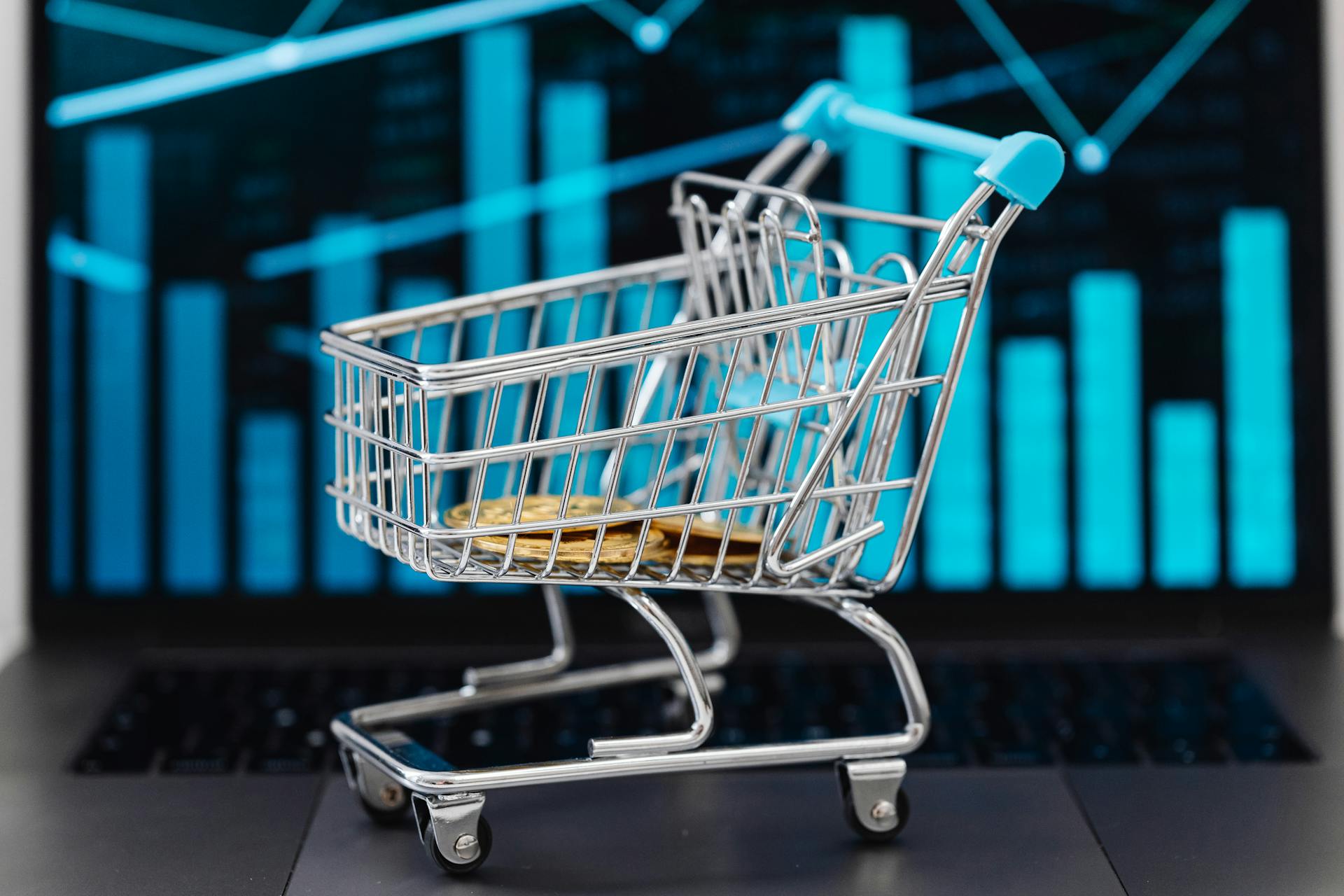
A one-product store is exactly what it sounds like: a store built around a single offer. One product. One message. One clear outcome for the customer.
Instead of dividing attention across dozens of items, everything is focused on converting interest into action.
When executed correctly, this model is powerful. Traffic is simpler to target.
Messaging is sharper. Data is cleaner. Every improvement compounds because you are optimizing one funnel, not an entire catalog.
But most one-product stores fail for a simple reason. They rely on the product alone and ignore optimization.
A good product without clear positioning, trust signals, and a frictionless design will not convert consistently. Traffic exposes weaknesses. It does not fix them.
This guide shows you how to build a store that performs. You will learn how to structure your page, strengthen your messaging, reduce friction, and increase buyer confidence.
The goal is simple: higher conversion rates, stronger return on ad spend, and a store that earns trust at scale.
Want a complete breakdown? Read the full Shopify product page optimization guide to improve your conversions step by step.
What is a one-product store?
A one-product store is a focused ecommerce model built around a single core offer, where the homepage, product page, messaging, visuals, and checkout are all engineered to sell one solution without distraction.
Structurally, it usually functions as a streamlined sales funnel: a strong hero section that communicates the problem and promise, benefit-driven sections that educate and persuade, social proof that builds credibility, and a frictionless checkout that removes doubt.
Unlike a general store that sells many unrelated items, or a niche store that sells multiple products within a category, a one-product store concentrates all traffic, data, and optimization efforts into one conversion path.
This focus simplifies decision-making for the customer and simplifies testing for the operator.
When does this model work best? It performs strongest when the product solves a clear, painful problem, has strong perceived value, and can be demonstrated visually.
It also works well when paid traffic is the primary growth driver because a single-offer funnel is easier to align with ad creatives and messaging.
Brands like BlendJet, which centered early growth around a portable blender, or Snow Teeth Whitening, which built momentum around a flagship whitening kit, demonstrate how powerful focused positioning can be.
Even companies like Gymshark started with a narrow product focus before expanding. The principle is simple: clarity converts.
When everything on the page points to one outcome, customers feel guided rather than overwhelmed, and that is where conversion performance improves.
Foundation: Product-Market Fit
Product-market fit is the foundation of every high-performing one-product store because optimization amplifies what already works; it does not fix a weak offer.
Identifying a winning product starts with measurable demand and strong margins, not personal preference.
Look for products that solve a specific frustration, are easy to demonstrate visually, have clear differentiation, and allow enough markup to support paid traffic while remaining competitive.
A winning product creates an immediate “that’s useful” reaction. It should either save time, reduce pain, improve results, or remove inconvenience in a way customers instantly understand.
Solving a clear problem is critical because vague benefits do not convert; clarity does.
If you cannot explain the problem and outcome in one direct sentence, your messaging will struggle. Before investing time into design or ads, validate demand.
Analyze search volume, competitor activity, ad presence, and customer reviews in the market. If others are spending consistently on ads, that signals economic viability.
If customers leave detailed reviews describing real results, that signals a genuine need.
You can also test with a simple landing page and small paid traffic campaign to measure click-through rate and conversion intent before scaling.
Finally, recognize when the product is not ready. Low click-through rates despite strong creatives, frequent refund requests, unclear product benefits, weak margins, or difficulty explaining the value in simple terms are warning signs.
If traffic lands but does not engage, the issue is often the offer itself. Fix the product positioning first. Optimization only works when the foundation is solid.
Homepage Optimization
Clear Value Proposition Above the Fold
The first screen determines whether a visitor stays or leaves.
Your value proposition must immediately answer three questions: What is this? Who is it for? Why should I care? Clarity outperforms creativity here.
A strong headline communicates the primary benefit in plain language, supported by a short subheading that reinforces the outcome or differentiator.
Avoid vague phrases and generic claims. If a visitor cannot understand the offer within five seconds, attention drops and conversion probability declines.
Place this messaging prominently above the fold so it is visible without scrolling. This section is not for storytelling. It is for positioning.
Strong Hero Image or Demo Video
Visual proof reduces doubt faster than text. Your hero image or demo video should show the product in use, highlight the result, and reinforce the promise made in the headline.
Static product shots on white backgrounds rarely convert at scale because they lack context. Instead, show the transformation, the environment, or the real-life use case.
If possible, use a short autoplay video that demonstrates the product solving the problem in seconds. Keep it focused and clear.
Problem → Solution Messaging
An effective homepage structure follows a logical persuasion path. First, identify the problem clearly and directly. Speak to the frustration or inconvenience the customer already feels.
Then transition into how your product solves it. This contrast creates relevance and emotional engagement.
Structure the messaging in short sections that move from pain point to relief, then to specific benefits. Avoid feature overload. Focus on outcomes.
When visitors recognize their problem in your copy, they feel understood. When they see a clear solution, they begin to justify buying.
Social Proof Placement
Trust must be built early, not at the bottom of the page. Integrate social proof near the top of the homepage, ideally beneath the hero section.
This can include star ratings, customer testimonials, review counts, or media mentions. The placement matters because visitors look for validation before committing attention.
If proof is hidden too far down, skepticism grows. Highlight real experiences and specific results rather than generic praise.
Credible social proof shortens the decision process. It shifts the question from “Does this work?” to “Is this right for me?”
Clear Call-to-Action (CTA)
Every section should guide visitors toward a single action. Your primary CTA must be visible above the fold and repeated strategically throughout the page.
Use direct language such as “Shop Now,” “Get Yours Today,” or “Try It Risk-Free.” Avoid multiple competing buttons that split attention.
Color contrast should make the CTA stand out clearly from the rest of the design. Position it after persuasive sections so the user always has a next step.
A homepage without a strong CTA creates interest without direction.
Removing Distractions (No Unnecessary Navigation Links)
Focus increases conversions. A one-product store homepage should minimize navigation options that pull users away from the main offer.
Remove unnecessary menu links, external redirects, and unrelated content blocks. Keep the structure simple and linear.
If additional information is needed, include it within the page rather than sending visitors elsewhere. Each extra click adds friction. Each distraction reduces momentum.
When the homepage acts as a guided path instead of a browsing experience, conversion performance improves measurably.
Product Page Optimization
Your product page is where interest turns into revenue. Every element must reduce doubt, increase clarity, and move the visitor toward purchase without friction
1. Product Images & Media
Visual content carries the majority of persuasion weight on a one-product store. Buyers want to see proof before they read claims.
High-Quality Images (Multiple Angles)
Use sharp, well-lit images that show the product from multiple angles. Include close-ups of important details, textures, and components.
If a visitor cannot clearly see what they are buying, hesitation increases. Clear visuals answer unspoken questions and reduce return rates.
Lifestyle Photos
Context increases desire. Show the product being used in real-world environments that match your target audience.
Demonstrate scale, practicality, and emotional appeal. When customers see someone like them using the product, they imagine ownership. That shift matters.
Demonstration Videos
A short, focused demo video can outperform long descriptions. Show how the product works, how it solves the problem, and what the result looks like.
Keep it simple. No unnecessary edits. The objective is understanding, not entertainment. When users grasp functionality quickly, conversion rates rise.
GIFs for Feature Explanation
Use short looping GIFs to highlight key features in action. This works especially well for mechanisms, transformations, or step-by-step processes.
GIFs break down complexity into seconds. They keep engagement high while reinforcing clarity.
2. Product Description Structure
Your copy must guide thinking. Structure drives persuasion.
Hook Headline
Start with a bold, benefit-driven headline that reinforces the core promise. It should echo the main outcome the buyer wants. This anchors attention before scrolling continues.
Problem Agitation
Briefly address the frustration the customer already experiences. Make it specific and relatable.
When visitors feel understood, resistance lowers. Keep it direct. Avoid exaggeration.
Solution Explanation
Explain how the product resolves the problem in simple terms. Focus on how it works and why it works.
Remove technical jargon unless it strengthens credibility. Clarity builds confidence.
Benefits (Not Just Features)
Translate every feature into a meaningful outcome. A feature describes what it is. A benefit explains why it matters.
Buyers make decisions based on improvement to their life, not specifications.
Bullet-Point Scannability
Structure key benefits in short bullet points. Most users scan before they read fully.
Bullets increase readability and comprehension. Keep them concise and outcome-focused. Each point should strengthen the purchase decision.
3. Trust Signals
Trust removes friction. Without it, even strong products struggle to convert.
Reviews and Testimonials
Display detailed customer reviews directly on the product page. Highlight specific results rather than generic praise.
Authentic experiences reduce uncertainty. Quantity also matters. A higher review count signals validation.
Star Ratings
Place star ratings near the product title and price. This is where decision-making begins.
Immediate visibility of positive ratings increases perceived reliability within seconds.
UGC (User Generated Content)
Incorporate photos or videos from real customers using the product. UGC feels less scripted and more believable. It bridges the gap between marketing claims and real-world proof.
Guarantees (Money-Back, Secure Checkout)
Offer a clear refund or satisfaction guarantee. State it confidently. Also include visible secure checkout badges.
Buyers want to know that their payment and purchase are protected. Guarantees reduce risk perception.
Shipping Transparency
Clearly explain shipping times, costs, and tracking expectations. Uncertainty around delivery creates abandonment.
When timelines are upfront and realistic, customers feel informed rather than misled. Transparency increases trust and lowers support issues.
Conversion Rate Optimization (CRO) Essentials
1. Speed Optimization
Speed directly impacts revenue. When load time increases, conversion rate decreases. Visitors interpret slow pages as risk.
Even a one-second delay can reduce engagement, increase bounce rate, and weaken ad performance. Performance is not cosmetic. It is structural.
Page Load Time Importance
Your goal should be a fast initial load and smooth interaction. Pages must render quickly on both desktop and mobile networks.
Slow performance reduces trust before the visitor even reads your offer. Faster pages feel more credible and easier to navigate.
Compressing Images
Large image files are one of the biggest causes of slow stores. Compress all images without sacrificing visible quality.
Use properly sized files rather than uploading oversized assets and letting the browser resize them. This reduces server load and improves speed metrics immediately.
Minimizing Apps
Every installed app adds scripts, requests, and potential delays. Audit your store regularly. Remove non-essential tools.
If an app does not directly increase conversions or revenue, question its value. A lean backend produces a faster frontend. That speed translates into higher performance.
2. Mobile Optimization
Most traffic for one product stores comes from mobile devices. If the mobile experience is weak, scaling becomes expensive.
Optimization must start with mobile, not adapt to it later.
Mobile-First Design
Design layouts for smaller screens first. Keep sections compact and vertically structured.
Avoid cluttered columns. Ensure text is readable without zooming. A mobile-first layout forces clarity and improves usability across all devices.
Thumb-Friendly Buttons
Buttons must be large enough to tap easily and spaced to prevent accidental clicks. Place primary CTAs within natural thumb reach zones.
Frustration during interaction lowers purchase intent quickly. Smooth navigation increases completion rates.
Shortened Checkout Flow
Reduce the number of fields and steps required to complete a purchase. Offer express checkout options where possible.
Eliminate unnecessary account creation requirements. Each extra step increases drop-off probability. A shorter checkout keeps momentum intact.
3. CTA Optimization
Your call-to-action is the decision trigger. It must be visible, clear, and compelling without being aggressive.
Placement
Position your primary CTA above the fold and repeat it after persuasive sections.
Never force users to scroll back up to take action. Strategic repetition increases clicks without feeling pushy.
Color Contrast
Use a CTA color that clearly stands out from the rest of the design. It should draw attention naturally.
Avoid blending it into your brand palette if it reduces visibility. Contrast guides the eye and improves click-through rates.
Urgency Triggers
Use urgency carefully and honestly. Limited-time offers, stock indicators, or delivery cutoffs can increase action when they are real.
False scarcity damages trust long-term. Ethical urgency strengthens decision-making by reducing hesitation, not by manipulating fear.
Checkout Optimization
Checkout is where intent becomes revenue. By this stage, the visitor has already accepted the product and the price.
Your role now is simple: do not break momentum. Every extra step, delay, or doubt increases abandonment risk.
One-Page Checkout
A one-page checkout reduces cognitive load. Instead of splitting information across multiple screens, it presents billing, shipping, and payment fields in a single structured view.
This transparency helps users see progress instantly. They know how much is left. They know what is required. Fewer steps mean fewer drop-off points. Keep the layout clean.
Remove unnecessary fields. Only collect information essential to fulfill the order. The objective is completion, not data collection.
Shop Pay / Express Checkout Options
Speed increases conversions. Offering accelerated payment options like Shop Pay, Apple Pay, or Google Pay reduces manual form entry.
Many users prefer one-click solutions because they feel secure and efficient. These options also improve mobile conversions where typing is slower.
Place express checkout buttons prominently at the top of the checkout page. When customers see a faster path, hesitation decreases.
Removing Friction
Friction often hides in small details. Unexpected shipping costs. Forced account creation. Confusing error messages. Slow payment processing.
Each one weakens trust at a critical moment. Be upfront about total costs before checkout begins.
Allow guest checkout. Use clear field validation so users can correct mistakes easily. Simplify form design. The smoother the experience, the higher the completion rate.
Clear Return Policy
Risk perception peaks at checkout. A visible, concise return policy lowers that risk immediately. State the timeframe, conditions, and refund process in simple language.
Avoid legal jargon. When customers know they are protected, they are more comfortable finalizing payment. Confidence drives action.
Abandoned Cart Recovery Setup
Even optimized checkouts experience abandonment. What matters is recovery.
Set up automated abandoned cart emails that remind users of the product, reinforce benefits, and address common objections. Send the first reminder within hours, not days.
Consider a second follow-up with urgency or social proof. Track recovery rates and adjust messaging based on performance.
A structured recovery system turns lost intent into recovered revenue.
Social Proof & Authority Building
Influencer Collaborations
Strategic influencer partnerships provide borrowed credibility. The key is alignment, not follower count.
Work with creators whose audience matches your target buyer and whose content style feels authentic.
Micro-influencers often outperform larger accounts because engagement is stronger and trust is deeper.
Provide the product, allow honest feedback, and encourage real demonstrations rather than scripted endorsements.
When potential buyers see a trusted voice using the product naturally, perceived risk declines.
Performance improves when the collaboration feels like a recommendation, not an advertisement.
UGC Ads
User Generated Content performs well because it mirrors organic behavior. Real customers speaking in simple language create relatability.
UGC ads should show the product in everyday settings, highlight real results, and address common objections.
Keep them direct. Avoid heavy editing. The goal is authenticity.
When prospects see someone like them explaining why the product works, resistance lowers. UGC bridges the gap between marketing claims and lived experience.
Before/After Visuals
Transformation drives action. If your product creates visible change, document it clearly.
Before-and-after comparisons must be honest, consistent in lighting and angle, and easy to understand.
Visual contrast makes benefits tangible.
It answers the unspoken question: “Will this work for me?” Strong transformation visuals shorten the evaluation process and increase confidence quickly.
Press Mentions
Media features signal legitimacy. Even small publications can add authority if they are relevant to your niche.
Display press logos strategically near your product title or social proof sections. Avoid exaggeration. If coverage exists, link to it transparently.
Third-party recognition shifts perception from “new online store” to “recognized brand.” That distinction matters in competitive markets.
Certifications
Certifications and compliance badges reinforce safety and quality standards. This is especially important for health, beauty, food, or technical products.
Clearly display any verified certifications with concise explanations of what they represent.
Customers do not need complex details. They need reassurance that the product meets recognized standards. Certifications reduce uncertainty and strengthen credibility.
Upsells & Revenue Expansion
Revenue growth does not always require more traffic. In a one-product store, increasing average order value is often faster and more profitable than scaling acquisition.
Bundles
Bundles increase perceived value while raising order size. Combine complementary items or offer multi-unit packages at a slight discount.
Position bundles as a smarter choice rather than an upsell.
For example, a “Best Value” option with added savings or convenience framing performs better than a simple quantity increase.
Make the comparison clear. Show individual pricing versus bundled pricing so the advantage is visible.
When structured correctly, bundles improve margin and customer satisfaction at the same time.
Volume Discounts
Volume discounts work well for consumable or repeat-use products. Offer tiered pricing such as “Buy 2, Save 10%” or “Buy 3, Save 20%.”
Display the savings directly under the product price so the incentive is visible early. This encourages customers to calculate value before checkout.
The key is clarity. Keep discount tiers simple and easy to understand. Overcomplicated pricing reduces impact.
When customers feel they are maximizing value, they increase quantity naturally.
Post-Purchase Upsells
Post-purchase upsells occur after payment is completed, which removes risk from the initial decision. Present a one-click offer that complements the original purchase.
This could be an accessory, an add-on feature, or a discounted second unit. Because the transaction is already approved, resistance is lower.
Keep the offer relevant and time-sensitive. Avoid overwhelming the buyer with multiple options. One strong, aligned offer performs best.
Subscription Options (If Applicable)
If your product is consumable or used regularly, a subscription model increases lifetime value and stabilizes revenue. Offer flexible delivery intervals and clear cancellation terms.
Emphasize convenience and savings rather than locking customers into commitment. Transparency builds trust. Subscriptions should feel helpful, not restrictive.
Traffic Optimization
Traffic is leverage. Without it, optimization has no data. With the wrong kind of traffic, optimization becomes expensive.
The objective is not volume alone. It is qualified visitors who match your product and message.
1. Paid Traffic
Paid traffic gives speed and control. It allows you to test offers, messaging, and positioning quickly. But it only scales when the fundamentals are strong.
Creative Testing
Your ads determine who clicks. Test multiple angles, hooks, and formats. Change one variable at a time so you can isolate performance differences.
Focus on problem-focused hooks, benefit-driven messaging, and clear demonstrations.
Winning creatives usually highlight one core outcome clearly rather than listing features. When click-through rate improves, your traffic quality typically improves as well.
Landing Page Alignment
Message match is critical. The promise in the ad must continue on the landing page without disconnect. If the ad focuses on speed, the page must reinforce speed.
If the ad highlights savings, the page must emphasize value. Misalignment creates friction and lowers conversion rate. Consistency builds trust and improves return on ad spend.
Tracking Metrics (CTR, CVR, CPA)
Track the metrics that matter. Click-through rate (CTR) measures ad relevance. Conversion rate (CVR) measures page effectiveness.
Cost per acquisition (CPA) determines profitability. Do not evaluate ads based on clicks alone.
A high CTR with low CVR signals page issues. A strong CVR with low CTR signals weak creatives. Data should guide decisions, not assumptions.
2. Organic Traffic
Organic traffic compounds over time. It requires patience but reduces dependency on paid channels.
SEO for One-Product Stores
Even a single-product store can rank for problem-based and solution-focused keywords. Optimize your product page for primary search intent.
Use clear headings, descriptive copy, and structured content. Build supporting pages that answer common questions and objections.
Search engines reward clarity and depth. Ranking for high-intent terms brings visitors who are already looking for a solution.
Content Strategy
Create content that supports the buying journey. This can include comparison articles, use-case guides, problem breakdowns, and educational posts related to your product.
Each piece should lead naturally back to your core offer. The goal is not traffic for its own sake.
It is relevance. High-quality content builds authority and improves conversion readiness.
Email Marketing Automation
Email captures and nurtures intent. Set up flows for welcome sequences, abandoned carts, post-purchase follow-ups, and re-engagement campaigns.
Email traffic converts higher because trust is already established. Keep messaging concise and benefit-driven.
Automation ensures consistent follow-up without manual effort.
Analytics & Continuous Optimization
Optimization without measurement is guesswork. A one-product store has an advantage: every visitor moves through the same funnel.
That makes data cleaner and insights clearer. Your responsibility is to track the right metrics and act on them systematically.
Key Metrics to Track
Start with revenue per visitor. This metric combines traffic quality and conversion strength into one number.
Then monitor conversion rate, average order value, and cost per acquisition. Together, these define profitability. Track bounce rate and time on page to understand engagement.
Monitor checkout abandonment rate to identify friction points. Do not overload your dashboard with vanity metrics.
Focus on numbers that directly influence revenue decisions. If a metric does not guide action, it does not deserve attention.
A/B Testing Strategy
Testing should follow a structured hypothesis, not random changes. Identify the weakest point in your funnel first.
For example, a low add-to-cart rate suggests messaging or offer issues. Low checkout completion suggests friction or trust gaps.
Form a clear hypothesis, such as “Adding stronger social proof above the fold will increase add-to-cart rate.” Test one major variable at a time.
Allow enough traffic to reach statistical confidence before deciding. Small, measurable improvements compound faster than dramatic redesigns.
Heatmaps and Session Recordings
Quantitative data shows what is happening. Behavioral tools show why. Heatmaps reveal where users click, scroll, and lose attention.
Session recordings expose confusion, hesitation, or navigation issues. Watch real interactions. Notice where users pause. Notice where they exit.
Patterns reveal friction points you may not see from metrics alone. Use these insights to refine layout, clarity, and flow.
Iteration Framework
Continuous optimization requires a repeatable process.
Analyze data. Identify bottlenecks. Form a hypothesis. Implement one change. Measure results. Document findings. Repeat. Avoid reacting emotionally to short-term fluctuations.
Look for trends over consistent traffic volume. Keep a log of all tests and outcomes to prevent repeating failed ideas. Improvement should be incremental and deliberate.
Over time, structured iteration turns a good store into a high-performing asset.
Common One Product Store Mistakes
Overcomplicated Design
Simplicity converts. Many store owners add excessive animations, pop-ups, color variations, and unnecessary sections in an attempt to look “premium.” The result is cognitive overload.
When visitors must work to understand the offer, conversion rates decline. A one-product store should guide attention in a straight line: problem, solution, proof, action.
Remove decorative elements that do not strengthen persuasion. Clean layouts outperform visually busy designs because clarity reduces friction.
Weak Messaging
Design cannot compensate for unclear positioning. If your headline is vague, benefits are generic, or the value proposition lacks specificity, visitors disengage quickly.
Messaging must communicate a clear outcome in simple language. Replace broad claims like “High Quality” with measurable or experiential benefits.
Speak directly to the problem and the transformation. When messaging is sharp, engagement increases. When it is weak, traffic becomes expensive.
No Proof
Claims without validation create doubt. Without reviews, testimonials, demonstrations, or third-party validation, visitors hesitate at critical decision points.
Even strong products struggle to convert without visible proof. Social validation reduces perceived risk and accelerates trust.
If your store lacks proof, prioritize gathering customer feedback and displaying it prominently. Trust is not assumed. It is earned.
Ignoring Mobile
Most one-product stores receive the majority of traffic from mobile devices.
Designing primarily for desktop leads to cramped layouts, small buttons, and poor checkout flow on smaller screens.
This directly impacts revenue. Always review the full funnel on mobile first. Ensure text is readable, buttons are easy to tap, and checkout is smooth.
Mobile optimization is not optional. It is foundational.
Scaling Ads Before Fixing Conversion
Increasing ad spend does not fix a weak funnel. It magnifies inefficiencies. If your conversion rate is low, scaling traffic increases losses rather than profits.
Before increasing the budget, analyze performance data. Improve messaging, proof, page speed, and checkout flow first.
A small lift in conversion rate can dramatically improve return on ad spend. Optimize before you scale. Discipline here protects capital and accelerates sustainable growth.
Final Thoughts
Optimization is not about making your store look better. It is about making it convert better.
Design supports persuasion, but persuasion drives revenue. Every section, image, and sentence must move the buyer closer to confidence.
Clarity wins. Trust converts. Simplicity scales. When your message is direct, your proof is visible, and your funnel is frictionless, performance improves naturally.
Avoid chasing quick hacks. Sustainable growth comes from structured testing, measured adjustments, and disciplined execution. Improve one variable at a time.
Let data guide decisions. That is how a one-product store becomes a predictable revenue asset rather than a temporary experiment.
If you want the full strategy, check out this complete guide to Shopify product page optimization and start improving results today.
FAQs
Are one-product stores still profitable in 2026?
Yes, if the product solves a real problem and the funnel is optimized.
The model remains profitable because focus improves messaging, testing speed, and conversion efficiency.
Profitability depends on margins and execution, not the store format itself.
How many products should a one-product store really have?
Ideally, one core product with optional variants, bundles, or complementary upsells. The focus should remain on a single primary offer.
Adding unrelated products weakens clarity and reduces conversion strength.
What is a good conversion rate for a one-product store?
A healthy range is typically 2% to 4%, depending on traffic quality and price point.
High-performing stores can exceed this. The real benchmark is profitability at your cost per acquisition.
Should I use Shopify or WooCommerce?
Shopify is generally faster to launch and easier to manage, especially for paid traffic stores. WooCommerce offers more flexibility but requires more technical control.
How much traffic do I need to succeed?
There is no fixed number. You need enough qualified traffic to generate consistent data and profitable conversions.
A small volume of high-intent visitors converts better than large amounts of untargeted traffic. Focus on quality first, then scale volume once the funnel performs.

Hi, I’m Ethan Caldwell. After transitioning from IT into eCommerce in 2017, I’ve spent the last 9 years building and optimizing Shopify stores. I focus on conversion rate optimization, breaking down what actually improves conversions into clear, practical insights.