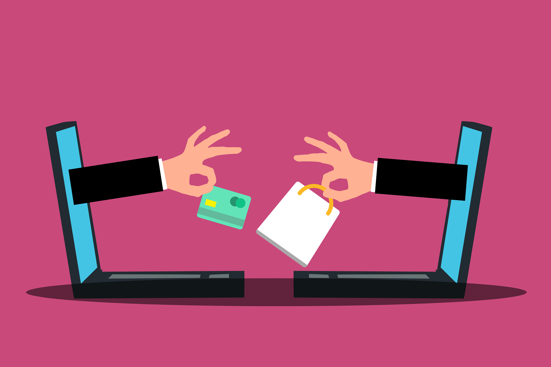
Shoppers don’t abandon checkout because they don’t want the product. They leave because something feels uncertain.
Purchase anxiety is the hesitation that happens when buyers question security, pricing, delivery, or returns at the final step.
Even highly motivated customers will pause if costs appear late, forms feel complicated, or payment security isn’t clear.
Small doubts compound quickly. And in checkout, doubt kills momentum.
Checkout confidence is not luck. It is engineered through deliberate UX decisions that reduce friction and reinforce trust at every step.
In this guide, you’ll learn the specific UX elements that lower anxiety, increase clarity, and move customers from hesitation to completion—without gimmicks or aggressive tactics.
Learn how to simplify your store and boost sales with this Shopify UX and conversion strategy guide.
What Is Purchase Anxiety?
Purchase anxiety is the hesitation a customer feels right before completing a transaction.
It happens when confidence drops at the final step. The product may be right.
The price may be acceptable. But uncertainty enters the decision process and slows it down.
In e-commerce, this hesitation often appears during checkout—where commitment becomes real.
Psychological Triggers Behind Hesitation
Purchase anxiety is not random. It is triggered by specific signals in the buying experience.
1. Fear of Fraud
If a site looks unpolished, unfamiliar, or insecure, customers question its legitimacy. Missing trust indicators or unclear business information amplify this fear.
2. Hidden Costs
Unexpected shipping fees or taxes introduced late in checkout create friction. Surprises damage trust immediately and often lead to abandonment.
3. Complicated Returns
If return policies are hard to find or difficult to understand, customers assume risk. Unclear processes increase perceived loss.
4. Payment Security Concerns
When payment pages lack visible security cues, customers hesitate. They need reassurance that their financial data is protected.
How Anxiety Impacts Conversion Rates
Anxiety interrupts momentum.
Even small doubts increase cognitive load and delay action. The longer a customer pauses, the more likely they are to reconsider the purchase entirely.
High checkout abandonment rates are rarely about product demand. More often, they reflect unaddressed uncertainty within the user experience.
Common Checkout Friction Points
- Unexpected shipping costs – Surprise fees introduced late in checkout immediately reduce trust and increase abandonment.
- Forced account creation – Requiring registration before purchase adds friction and interrupts buying momentum.
- Long, complex forms – Excessive fields increase cognitive load and make completion feel time-consuming.
- Slow page load times – Delays create doubt, reduce confidence, and give users time to reconsider.
- Limited payment options – When preferred payment methods are unavailable, customers hesitate or exit.
- Poor mobile optimization – Cluttered layouts, small tap targets, and difficult input fields frustrate mobile buyers and drive drop-offs.
Trust-Building UX Elements That Increase Checkout Confidence
1. Transparent Pricing
Price clarity is one of the strongest drivers of checkout completion. When customers understand the full cost early, they commit with confidence.
Display shipping fees, taxes, and any additional charges before the final payment step. Ideally, show estimated totals on the cart page.
If costs vary by location, provide real-time calculations once a postal code is entered. The goal is simple: no financial surprises.
Unexpected charges feel deceptive, even when unintentional. They break trust instantly. When totals increase without warning, customers reassess the entire purchase.
If there are savings—discounts, bundles, free shipping thresholds—make them visible and easy to understand.
Show the original price, the amount saved, and the final total. Clear math reduces friction. Clarity reinforces fairness.
2. Security & Payment Reassurance
Payment is the highest-risk moment in the customer’s mind. Your interface must actively reduce that perceived risk.
Display SSL or security badges near the payment section, not buried in the footer. Visual reassurance at the point of decision matters most. Placement is strategic.
Use concise messaging such as “Secure Checkout” or “Your payment information is encrypted.” Keep it brief. Long technical explanations create more confusion than comfort.
Include familiar payment logos like Visa, Mastercard, PayPal, and Apple Pay. Recognition lowers hesitation. Customers trust systems they already use.
A single line of microcopy explaining that payment data is encrypted and never stored improperly can meaningfully reduce doubt. Confidence increases when risk feels controlled.
3. Clear Return & Refund Policies
Returns represent perceived risk. The harder they are to understand, the less likely customers are to complete the purchase.
Place a short, plain-language return summary near the primary call-to-action. For example: “30-day returns. No restocking fees.” This removes uncertainty at the moment of commitment.
Link to the full return policy for transparency. Customers who want details should be able to access them easily. Hiding policies signals avoidance.
If you offer free returns, state it clearly. “Free returns” is not a minor detail. It directly lowers perceived loss and increases willingness to buy.
Clarity here converts hesitation into reassurance.
4. Progress Indicators
Uncertainty about effort increases abandonment. Customers want to know how long checkout will take.
Use a step-by-step progress bar that clearly shows stages such as Shipping → Payment → Review. Visual structure reduces stress. It makes the process feel manageable.
Include short confirmation cues like “Step 2 of 3” or “You’re almost done.” These messages maintain momentum. They communicate progress, not pressure.
When customers can see the end, they are more likely to continue. Predictability reduces anxiety. Structure builds confidence.
5. Guest Checkout Option
Forced account creation interrupts buying momentum. At the point of payment, customers want completion, not commitment to a relationship.
Requiring registration adds friction. It introduces extra fields, password rules, and another decision.
That small barrier is enough to trigger abandonment, especially for first-time buyers who are still evaluating trust.
Offer guest checkout as the default or clearly visible option. Reduce the process to what is necessary to fulfill the order. Nothing more.
If you want customers to create accounts, present the option after purchase.
On the confirmation page, offer a simple way to save their details with one click. At that stage, trust has already been earned. The timing changes the response.
Checkout is for transactions. Account creation is a secondary objective. Keep the sequence aligned with intent.
6. Autofill & Smart Forms
Forms are one of the highest-friction areas in checkout. Every field adds effort. Effort increases hesitation.
Enable address auto-complete so customers can fill in details in seconds rather than typing full entries. Speed reduces cognitive load. It also lowers the risk of input errors.
Limit required fields to essential information only. Remove unnecessary data collection.
If a phone number is optional, make it optional. Each removed field increases the completion probability.
Use inline validation to prevent errors before submission. Highlight issues immediately and explain them clearly.
For example, instead of “Invalid entry,” state “Please enter a valid postal code.” Direct guidance prevents frustration.
Smart forms feel responsive and supportive. Poor forms feel like obstacles. The difference shows in your conversion rate.
7. Social Proof at Checkout
Social proof reinforces that the decision is safe. At checkout, customers are validating their choice one last time.
Display star ratings near product summaries to confirm satisfaction. Visual ratings are processed quickly. They signal consensus without requiring deep reading.
Short testimonials can add reassurance, especially if they mention reliability, shipping speed, or product quality. Keep them concise. At this stage, clarity matters more than storytelling.
Highlight metrics such as “Trusted by 25,000 customers” when accurate. Specific numbers increase credibility. Vague claims do not.
Real-time purchase notifications can add momentum, but use them carefully. Overuse creates distraction. Subtle implementation works best. The goal is reassurance, not noise.
Trust grows when buyers see that others have completed the same action successfully.
8. Mobile-Optimized Checkout
Mobile traffic often represents the majority of sessions. If checkout is not optimized for mobile, confidence drops quickly.
Use large tap targets for buttons and form fields. Small clickable areas cause input errors and frustration. Ease of interaction matters more than visual complexity.
Adopt a simplified, one-column layout. Stacked sections guide the eye naturally from top to bottom. Multiple columns increase confusion on small screens.
Remove unnecessary elements. Navigation menus, banners, and promotional blocks distract from completion.
Page speed is critical. Slow-loading checkout pages create doubt. Customers interpret delay as instability. Optimize scripts, compress assets, and minimize heavy design elements.
Mobile checkout should feel fast, clear, and controlled. When interaction is smooth, confidence follows.
Microcopy That Reduces Anxiety
Microcopy is small, but its impact is not.
At checkout, customers read more carefully. They are evaluating risk.
The words around buttons, forms, and confirmations either reinforce confidence or introduce doubt.
Reassuring Button Text
Generic buttons like “Submit” or “Continue” lack clarity. They do not confirm what will happen next.
Use action-oriented and reassuring language such as “Secure Checkout” or “Complete Order Securely.”
These phrases communicate both intent and safety. They answer the silent question: Is this safe to click?
Avoid aggressive language like “Buy Now” at the payment stage if it feels abrupt. The goal is confidence, not pressure.
Small wording adjustments reduce hesitation. Clear intent increases clicks.
Delivery Time Clarity
Uncertainty about delivery creates friction. Customers want to know when they will receive the product before they pay.
Display estimated delivery dates near the order summary. Be specific where possible. “Arrives between March 3–5” is stronger than “Ships soon.”
If shipping times vary, explain why. Transparency reduces suspicion. Vague promises increase risk perception.
When timelines are clear, customers can justify the purchase internally. That internal justification drives completion.
Payment Confirmation Messaging
Once payment is submitted, anxiety does not disappear immediately. Customers need reassurance that the transaction was successful.
Show a clear confirmation message instantly. Use direct language such as “Payment Successful” or “Your Order Is Confirmed.” Avoid ambiguous phrasing.
Include a short summary of what happens next. For example: “You’ll receive a confirmation email within a few minutes.” Setting expectations prevents follow-up doubt.
Confidence extends beyond the click. Reinforce it immediately.
Error Message Tone: Helpful vs. Alarming
Errors during checkout are high-risk moments. Poor messaging increases frustration and abandonment.
Avoid vague alerts like “Error occurred.” Instead, explain the issue clearly and provide a solution. “Your card number appears incomplete.
Please check and try again.” Specific guidance restores control.
Keep the tone calm. Do not use language that implies fault. The user is not the problem; the form is.
Well-written error messages reduce stress. They turn friction into correction rather than exit.
At checkout, every word either builds trust or erodes it. Microcopy should always move customers toward clarity and completion.
Visual Design & Layout Considerations
Clean, Uncluttered Interface
A crowded checkout increases cognitive load. Too many elements compete for attention and slow decision-making.
Remove secondary navigation, promotional banners, and unrelated content. Checkout should have one objective: completion. Every extra element introduces a distraction.
Keep sections structured and predictable. Shipping details, payment information, and order summary should be clearly separated. Clear structure reduces mental effort.
Simplicity is not minimalism for style. It is functional clarity that supports conversion.
Consistent Branding
Design inconsistency creates subtle distrust. If checkout looks different from the rest of the site, customers question whether they are still in the same environment.
Maintain consistent colors, typography, and visual tone. The transition from product page to checkout should feel seamless.
Brand consistency reinforces legitimacy. It signals stability and professionalism.
Avoid overdesigning the checkout page with new styles or experimental layouts. Familiarity supports confidence.
Use of White Space
White space improves readability and focus. It separates elements and makes forms easier to scan.
When fields are tightly packed, users feel overwhelmed. Spacing reduces that pressure. It creates breathing room.
Clear spacing around sections also emphasizes hierarchy. Customers can quickly understand what to complete first and what comes next.
White space is not empty. It is structural clarity.
Highlighting the Primary CTA
The primary call-to-action must be visually dominant. If customers hesitate to find the next step, friction increases.
Use contrast strategically so the main button stands out from the background. It should be immediately visible without competing colors nearby.
Avoid multiple primary buttons on the same screen. Competing actions divide attention.
The checkout page should visually guide the eye toward completion. When the next step is obvious, hesitation decreases.
Design influences trust before a single word is read. Clean structure, visual consistency, and clear emphasis make the decision feel controlled and safe.
Reducing Cognitive Load
Cognitive load increases when customers are forced to think too much during checkout, and thinking too much slows decisions.
Limit choices to what is essential; every extra option introduces evaluation time and weakens momentum.
If multiple shipping methods are available, prioritize one recommended option instead of presenting a long, equal-weight list.
Default smart selections—such as pre-selecting the most common shipping method or billing address matching shipping—reduce micro-decisions without removing control.
Customers can still change the option, but most will not need to. That quiet efficiency matters. Save cart functionality also lowers pressure by removing the fear of losing progress.
When customers know their items and details will remain intact, they feel less urgency-driven stress and more control over timing.
Finally, remove distractions during checkout. Eliminate promotional pop-ups, cross-sell sliders, and unnecessary navigation links.
Checkout is not the moment to reintroduce browsing behavior. It is the moment to simplify the path to completion.
The fewer decisions a customer must make, the more likely they are to follow through.
Post-Purchase Reassurance
Checkout confidence does not end when the payment is processed; it extends into the minutes immediately after purchase.
An immediate confirmation page is critical because it removes uncertainty the moment money leaves the customer’s account.
The message should be direct and unambiguous—“Order Confirmed” is stronger than vague success text.
Reinforce this confirmation with a clear order summary that displays purchased items, pricing breakdown, shipping details, and the total charged.
Customers instinctively verify accuracy. When the information is easy to scan, doubt fades quickly. Email confirmation timing also matters. Send it within minutes, not hours.
Delays create unnecessary concern and increase support tickets.
The email should restate key order details and outline what happens next, including estimated processing and shipping timelines.
Finally, provide delivery tracking information as soon as it becomes available. If tracking is not immediate, communicate when it will be issued.
Visibility into fulfillment reduces post-purchase anxiety and prevents second-guessing. The period after checkout is a trust-building window.
Handle it with clarity and speed, and customers remain confident in their decision.
Measuring Checkout Confidence
Checkout confidence should be measured, not assumed. If hesitation exists, your data will show it.
Key Metrics to Track
- Checkout Abandonment Rate – The percentage of users who start checkout but do not complete it. A high rate signals friction, uncertainty, or trust breakdown within the process.
- Conversion Rate – The percentage of total visitors who complete a purchase. While broader than checkout alone, shifts here often reflect improvements or issues in checkout confidence.
- Form Error Rate – The frequency of validation errors during checkout. Repeated errors indicate usability issues that increase frustration and anxiety.
- Time to Complete Checkout – The average time it takes a customer to finish the process. Excessive completion time often signals confusion, hesitation, or unnecessary steps.
Using Heatmaps and Session Recordings
Heatmaps reveal where users click, pause, or abandon. They highlight friction zones visually.
If users repeatedly hover over shipping costs or payment fields, that behavior often signals uncertainty.
Session recordings provide behavioral context. You can observe hesitation, repeated corrections, or form struggles in real time.
These patterns often expose issues that traditional metrics miss.
Use these tools to identify where confidence drops—not just where users exit.
A/B Testing Checkout Elements
Assumptions are expensive. Testing removes guesswork.
Run controlled A/B tests on elements such as button text, trust badges, progress indicators, or form layouts. Measure the impact on abandonment rate and completion rate.
Test one meaningful variable at a time. Small changes like clearer microcopy or simplified form fields can produce measurable lifts.
Checkout confidence is measurable. When you track the right signals and test deliberately, improvements become predictable rather than accidental.
Final Thoughts
Checkout confidence is not cosmetic. It directly influences whether revenue is captured or lost.
When pricing is clear, forms are simple, and trust signals are visible, hesitation drops. Small UX improvements compound.
A clearer button, a shorter form, or a stronger reassurance message can meaningfully increase completed purchases.
Audit your checkout with one question in mind: Where might a customer feel uncertain?
Identify friction. Remove it deliberately. Confidence is engineered, and when you design for it, conversions follow.
For practical ways to increase revenue, check out this Shopify UX and psychology framework.
FAQs
What causes checkout abandonment the most?
Hidden costs and forced account creation are among the biggest triggers.
How do I know if customers feel unsafe on my site?
Look for high checkout drop-off rates and payment-stage abandonment.
Are trust badges really effective?
They can help, especially for new or lesser-known brands.
Should I remove all distractions during checkout?
Yes. Minimize navigation and keep users focused on completing their purchase.

Hi, I’m Ethan Caldwell. After transitioning from IT into eCommerce in 2017, I’ve spent the last 9 years building and optimizing Shopify stores. I focus on conversion rate optimization, breaking down what actually improves conversions into clear, practical insights.