Pricing is not math. It’s perception.
Customers don’t calculate value the way store owners do. They compare. They scan. They anchor to the first number they see and judge everything else against it.
That split-second reference point quietly shapes whether your product feels expensive, fair, or like a deal.
On Shopify, this effect is amplified. Shoppers move fast. If you don’t control the anchor, the market will.
A competitor’s price, an old sale banner, or even your own layout can frame your offer in the wrong way.
This guide breaks down the psychology behind anchoring and shows you how to apply it with structure.
You’ll learn how to position prices strategically, increase perceived value, and lift conversions and average order value, without lowering your margins.
Because the goal isn’t to charge less, it’s to make your price make sense.
If you want higher conversions, don’t miss this guide to Shopify UX and customer behavior.
What Is Anchoring in Psychology?
Anchoring is a cognitive bias where people rely heavily on the first piece of information they see—usually a number—when making decisions, and every judgment that follows is adjusted around that starting point.
In pricing, the first number a customer encounters becomes the reference frame that defines what feels cheap, fair, or expensive.
If a shopper first sees $200 and then your product at $120, the $120 feels reasonable; if they see $120 with no context, it may feel high. The brain does not evaluate price in isolation.
It evaluates the price in comparison. Restaurants use this when they place a very expensive steak at the top of the menu to make other dishes seem more affordable.
SaaS companies display their highest-tier plan first to position the mid-tier as the smart choice.
Retail stores show a crossed-out “original price” to make the current offer feel like a gain rather than a cost.
In each case, the anchor sets expectations before the real decision is made.
This works especially well in e-commerce because online shoppers move quickly and lack physical context.
They can’t touch the product. They can’t ask a salesperson for reassurance. So they depend on visible cues—price order, compare-at pricing, bundles, tiers—to decide what makes sense.
On Shopify, the structure of your pricing page often matters more than the price itself.
If you control the first number they see, you influence the value they assign before logic even enters the conversation.
Why Anchoring Matters for Shopify Stores
- Online shoppers compare instantly: Customers rarely evaluate your price in isolation; they subconsciously compare it to the first number they see—whether that’s a crossed-out price, a higher-tier plan, or a competitor—so the initial anchor defines the context of the decision.
- Price anchors reduce decision friction: When you provide a clear reference point, you remove uncertainty and help shoppers justify their choice faster, which shortens the time between product view and purchase.
- Anchoring increases perceived savings: Showing a higher original price, bundle value, or premium tier reframes your current offer as a gain, making the discount feel real and emotionally rewarding rather than just numerically lower.
- The impact on conversion rate and AOV: Strategic anchoring doesn’t just lift conversions by improving perceived value; it also nudges customers toward higher-priced options, bundles, or larger quantities, increasing average order value without cutting margins.
Types of Anchoring You Can Use on Shopify
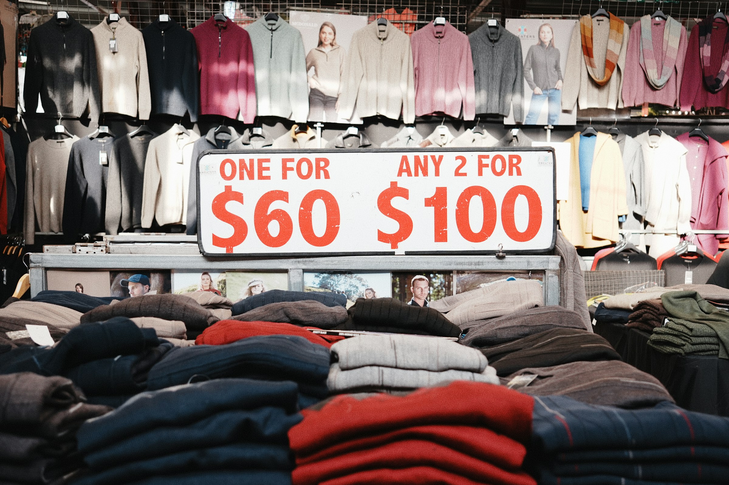
1. Original Price vs. Sale Price (Strike-Through Pricing)
Strike-through pricing works because it creates immediate contrast.
When a higher price is visibly crossed out next to a lower current price, the higher number becomes the anchor, and the lower number feels like a gain.
The customer is not just evaluating what they pay; they are reacting to what they believe they are saving.
This reframes the purchase from a cost decision to a value decision.
It works best when the original price is believable, historically accurate, and clearly justified by positioning, seasonality, or promotion.
If the anchor feels inflated or permanent, trust erodes, and the effect disappears.
Avoid fake “always on” discounts, inconsistent pricing across collections, and unclear savings messaging. Anchoring only works when credibility supports the contrast.
2. Tiered Pricing (Good–Better–Best Strategy)
Tiered pricing leverages structured comparison.
When customers see three options, they rarely choose the cheapest or the most expensive; they choose the option that feels balanced.
The middle tier often wins because it appears to offer the best value relative to the extremes.
This is where the decoy effect comes in. A higher-priced tier makes the middle option look rational and efficient, even if it carries the strongest margin.
On Shopify, this can be applied to bundles, product variations, or subscription levels.
Structure your tiers so each step up clearly increases perceived value, not just quantity.
Highlight the middle plan visually and articulate its advantages in concrete terms. The goal is not to overwhelm but to guide.
3. High-Priced Decoy Products
A premium product can serve as a strategic anchor, even if it sells in low volume. Its presence elevates the perceived value of everything beneath it.
When customers see a $300 option first, a $120 product feels more accessible and reasonable by comparison. This is psychological positioning, not accidental pricing.
In a product catalog, order matters. Place premium items early in collections or feature them prominently to frame the rest of the range.
The decoy must still be legitimate and valuable; it cannot look unrealistic.
When done correctly, the premium option increases revenue indirectly by reshaping how mid-tier products are judged.
4. Quantity Discounts & Volume Anchoring
Quantity breaks shift the anchor from single-unit pricing to multi-unit value. “Buy 3, Save 20%” changes the reference point from the cost of one item to the value of buying more.
The higher spend becomes the rational choice because the savings are tied to volume.
This strategy normalizes larger carts. Instead of asking, “Do I need one?” the customer starts thinking, “It makes sense to get three.”
On Shopify, display the total savings clearly and calculate the per-unit benefit to reinforce logic.
Ensure the discount is meaningful enough to justify the jump in quantity. Weak incentives fail to raise the anchor.
5. Subscription Anchoring
Subscription anchoring reframes time and cost. When you present monthly pricing alone, customers evaluate it as a recurring expense.
When you show the annual total first, you anchor them to the full-year value, making the monthly breakdown feel smaller and more manageable.
Conversely, showing the higher cumulative annual cost next to a discounted yearly plan makes the prepaid option feel financially smarter.
The structure determines perception. On product pages, clearly compare monthly and annual plans and quantify savings in both percentage and currency.
The anchor should make a long-term commitment appear logical, not risky. When positioned correctly, subscription anchoring increases retention and upfront revenue simultaneously.
The Decoy Effect: Anchoring’s Secret Weapon
The decoy effect is a pricing strategy where you introduce a third option designed not to sell the most, but to make another option look significantly more attractive by comparison.
It works by adding an asymmetrical choice—one that is clearly inferior to your target offer but similar enough to make the target seem like a smarter deal.
Customers rarely evaluate options in absolute terms; they compare relative value.
When a decoy is positioned correctly, it shifts preference toward the option you actually want to sell, usually your highest-margin or most strategically valuable product.
For example, on Shopify, you might offer a Basic bundle at $49, a Premium bundle at $89, and a “Pro” bundle at $99 that only adds minimal extra value beyond Premium.
The $99 option makes the $89 bundle feel efficient and well-priced, increasing the likelihood that customers choose it over the cheaper $49 option.
This same principle applies to subscriptions, quantity bundles, and product variations.
The decoy clarifies value differences and reduces indecision by making one option stand out as logically superior.
However, it should not be used when your product range is already simple or when price sensitivity is extreme, because adding complexity can create confusion rather than clarity.
It also fails if customers perceive manipulation or if the value gaps are unclear. The decoy must feel real, fairly priced, and strategically structured.
Charm Pricing & Number Framing
Charm pricing is the practice of ending prices in .99 or .95 to influence how the number is processed, and it works because customers read prices from left to right, giving disproportionate weight to the first digit they see.
A product priced at $49 is mentally categorized closer to forty than fifty, even though the difference is only one dollar, which subtly lowers perceived cost without reducing margin in a meaningful way.
This is called the left-digit effect, and it consistently improves conversion rates in price-sensitive environments because it makes the number feel smaller at a glance.
Odd pricing, such as $49 or $97, signals a deal-oriented or value-driven offer, while round pricing, such as $50 or $100, feels cleaner, more stable, and often more premium.
The choice between odd and round numbers should align with brand positioning and audience expectations.
If your store competes on value and volume, charm pricing reinforces affordability and urgency.
If you position yourself as a premium or luxury brand, excessive .99 endings can weaken perceived quality by making the offer look transactional rather than elevated.
In those cases, round numbers communicate confidence and reduce the sense of discounting.
Number framing also extends beyond decimals; presenting $1,200 as “$100 per month” changes perceived affordability by reframing scale, while removing unnecessary decimals on higher-ticket items can increase trust and clarity.
The key is consistency. Your pricing format signals your market position before customers read a single feature.
Choose the structure that supports the story your brand is telling, and test its impact on conversion rate and average order value rather than assuming one format fits all.
Visual Anchoring on Product Pages
Placement of Price on the Page
Where the price appears directly affects how it is interpreted.
If the price is positioned immediately near the product title, it becomes one of the first cognitive reference points the customer processes.
That early exposure establishes the anchor before competing information—like features or reviews—shifts attention.
On Shopify product pages, placing the compare-at price and current price above the fold ensures the anchor is set before scrolling begins.
If pricing is buried below long descriptions or collapsible sections, you lose control of the first reference point.
Structure matters. The goal is to make the intended anchor unavoidable but not overwhelming.
Font Size Hierarchy
Size communicates importance instantly. A larger crossed-out price above a slightly smaller sale price weakens the anchor; the hierarchy must reinforce the contrast.
The original price should be visible but visually secondary, while the current price should be dominant and clear.
If every number on the page is styled the same, there is no psychological emphasis. Strategic hierarchy guides the eye in a sequence: original price, current price, savings.
On Shopify, adjust typography so that the intended decision path is obvious without requiring effort.
Showing Savings vs Percentage vs Currency
How you display savings changes perceived value.
A “Save $40” message emphasizes tangible monetary gain, which works well for higher-ticket products where the currency amount feels significant.
A “Save 20%” message highlights proportional value, which can feel more impactful on lower-priced items.
In some cases, combining both strengthens the anchor by reinforcing the benefit from two angles.
The key is relevance. If the savings feel trivial in either format, the anchor weakens.
Choose the framing that makes the benefit feel meaningful relative to the product’s price point.
Using Color Contrast to Reinforce Anchors
Color directs attention before text is consciously read. If the original price and the sale price share the same color and weight, the contrast is diluted.
Using a muted tone for the crossed-out price and a stronger, high-contrast color for the current price reinforces the shift from anchor to offer.
Savings badges can use accent colors to create a visual cue of gain. However, overusing bright colors across the page reduces impact and creates noise.
The anchor should stand out because the rest of the layout is controlled. Effective visual anchoring is not about decoration; it is about guiding perception with precision.
Anchoring in Bundles & Upsells
Bundling and upselling amplify anchoring because they introduce direct price comparisons at the moment of highest buying intent.
When you use compare-at pricing for bundles—showing the total individual item value next to the discounted bundle price—you create a clear anchor that reframes the bundle as a gain rather than an added expense.
The customer sees what the items would cost separately, and the bundle price feels efficient and logical by contrast.
This works best when the savings are explicit and calculated transparently, not implied. Post-purchase upsell anchors operate differently but follow the same principle.
After a customer completes checkout, their spending threshold has already shifted upward, so presenting a higher “regular price” alongside a limited one-click offer makes the add-on feel small relative to the completed purchase.
The psychological anchor is now the total order value, not the original product price.
In the cart drawer, pricing psychology becomes even more sensitive because customers are reviewing their commitment.
Showing how much more they need to spend to unlock free shipping or a bundle discount reframes incremental spending as progress toward a reward.
The anchor moves from “What am I paying?” to “How close am I to the benefit?” When structured correctly, these touchpoints increase average order value without increasing friction.
The key is consistency, clarity, and visible comparison. Every bundle, upsell, and cart incentive should make the higher-value choice feel rational, not forced.
Common Mistakes That Destroy Price Anchors
- Fake discounts that damage trust: Inflated “original” prices or permanent sales weaken credibility, and once trust drops, the anchor loses its persuasive power.
- Overusing urgency and anchoring together: Stacking countdown timers, low-stock warnings, and aggressive price contrasts can feel manipulative, causing hesitation instead of accelerating decisions.
- Inconsistent pricing across pages: When collection pages, product pages, and cart totals display conflicting prices or savings, the anchor becomes unstable and creates doubt.
- Poor mobile presentation: If price contrast, hierarchy, or savings messaging is unclear on small screens, the anchor fails at the point where most buying decisions are made.
How to Test Anchoring Strategies on Shopify
A/B Testing Pricing Structures
Anchoring should be tested, not assumed. Small pricing shifts can produce meaningful revenue changes, but only if you isolate and measure them correctly.
A/B testing allows you to compare two versions of a pricing structure—such as different compare-at prices, tier layouts, bundle framing, or subscription displays—under the same traffic conditions.
The goal is to change how the price is presented, not the product itself, so you can measure perception impact without introducing new variables.
On Shopify, this can be executed through split testing tools or controlled theme variations.
Each version must run simultaneously to avoid seasonal or traffic-quality bias. If you test sequentially, external factors can distort results. Precision matters.
What Metrics to Track (CR, AOV, Revenue Per Visitor)
Conversion rate (CR) shows whether anchoring improves purchase decisions at the session level.
Average order value (AOV) reveals whether customers are moving toward higher-priced tiers, bundles, or quantities.
Revenue per visitor (RPV) combines both metrics and is often the most reliable indicator because it captures total monetization efficiency.
An anchoring strategy may slightly reduce conversion rate but increase AOV enough to raise overall revenue.
That tradeoff can be profitable. Focus on business impact, not vanity metrics. If RPV increases sustainably, the test is working.
Testing One Variable at a Time
Anchoring strategies often involve multiple elements—price size, crossed-out formatting, savings language, tier order, and color emphasis.
Changing several at once makes it impossible to identify what caused the lift or drop. Test one structural change at a time.
For example, adjust only the placement of the premium tier, or only the visibility of the compare-at price.
Clean tests produce actionable insight. Layered tests produce noise. Discipline in experimentation prevents misinterpretation and protects the margin.
Minimum Sample Size Considerations
Anchoring effects can appear quickly, but early data is often misleading. You need enough traffic and conversions to reach statistical reliability before drawing conclusions.
A common mistake is stopping a test after a few days because early results look positive. Short-term spikes frequently regress.
Establish a minimum conversion threshold before launching the test and commit to running it until that benchmark is met. The higher your traffic, the faster you can reach significance.
If traffic is low, extend the test duration rather than lowering your standards. Decisions based on weak data can damage pricing integrity.
Anchoring is powerful, but only when validated by disciplined measurement.
Implementation Checklist
- Audit current pricing structure: Review how prices are displayed across product pages, collections, cart, and checkout to identify inconsistencies, weak anchors, or missed contrast opportunities.
- Identify anchor opportunities: Look for areas where adding a clear reference point—such as compare-at pricing, tiered bundles, premium options, or volume discounts—can strengthen perceived value without reducing margin.
- Redesign product page layout: Adjust price placement, typography hierarchy, savings framing, and visual contrast so the intended anchor is seen first and interpreted correctly.
- Implement and test: Launch controlled A/B tests that isolate one anchoring change at a time to measure its direct impact on buyer behavior.
- Analyze results: Evaluate conversion rate, average order value, and revenue per visitor to determine whether the anchor improves overall revenue efficiency before scaling it across the store.
Final Thoughts
Pricing is not just a number on a page. It defines how your product is judged before logic fully engages.
Anchors guide decisions quietly but powerfully. The first number customers see becomes the reference point for everything that follows.
Small structural shifts—how you frame tiers, display discounts, or position premium options—can materially increase conversion rate and average order value without cutting margins.
Start simple. Test with discipline. Scale what proves profitable.
Get a better understanding of user behavior with this Shopify UX and psychology conversion guide.
FAQs
Does anchoring work for all niches?
Yes, but its strength varies by price sensitivity, competition, and brand positioning.
Can anchoring feel manipulative?
It can if the comparison is misleading or inflated; credibility must support the anchor.
Should small stores use premium anchors?
Yes, if the premium option is legitimate and strategically positioned to elevate mid-tier value.
How often should I change the pricing structure?
Only after structured testing; frequent untested changes reduce stability and trust.
What’s the safest anchoring strategy to start with?
Clear, honest compare-at pricing or simple tiered bundles with visible value differences.

Hi, I’m Ethan Caldwell. After transitioning from IT into eCommerce in 2017, I’ve spent the last 9 years building and optimizing Shopify stores. I focus on conversion rate optimization, breaking down what actually improves conversions into clear, practical insights.