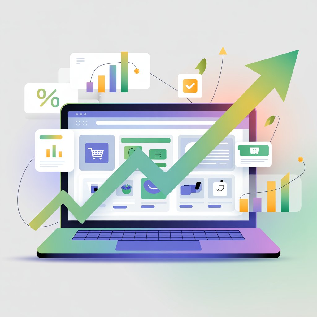
Most Shopify stores don’t have a product problem; they have a user experience problem.
Visitors leave not because they’re uninterested, but because something feels slow, confusing, or hard to use.
User experience (UX) is how easy and enjoyable your store is to navigate, from landing on the homepage to completing checkout.
Small friction points, like unclear buttons or cluttered pages, quietly kill conversions.
The good news is you don’t need a full redesign to fix it.
A few simple UX changes can make your store easier to use and quickly turn more visitors into customers.
Want a clearer path to more sales? Start with this Shopify UX and conversion psychology guide and apply the key principles.
What is UX and Why It Matters for Shopify Conversions
User experience (UX) is how easy, clear, and smooth it feels for someone to use your Shopify store from the moment they land on your site until they complete a purchase.
It covers everything: how fast pages load, how simple it is to find products, how clear your buttons are, and how effortless checkout feels.
When UX is strong, customers move through your store without friction.
When it’s poor, even small frustrations like slow loading, confusing navigation, or too many steps, cause them to leave.
This is why UX directly impacts your conversion rate, which is the percentage of visitors who actually buy.
Most Shopify stores convert at around 1–2%, while top-performing stores often reach 3% or higher, and the difference usually comes down to how easy the store is to use.
Improving UX removes barriers, builds trust, and helps customers take action faster, which leads to more completed purchases without needing more traffic.
Fix #1: Improve Page Load Speed
Page load speed is one of the fastest ways to improve conversions because it directly affects whether visitors stay or leave within seconds.
When a page takes too long to load, users lose patience and exit before they even see your product, which increases bounce rates and wastes your traffic.
Even a delay of one or two seconds can reduce conversions, especially on mobile, where users expect near-instant responses.
To understand where your store stands, use tools like Google PageSpeed Insights or GTmetrix to measure load times and identify problem areas such as large images, unused code, or slow server response.
The fixes are usually straightforward: compress and properly size your images so they load faster without losing quality, remove unnecessary apps that add extra scripts and slow down your store, and choose reliable, high-performance hosting to ensure consistent speed.
These changes reduce friction at the very first interaction, helping more visitors stay, browse, and ultimately convert.
Fix #2: Use Clear and Compelling CTAs
Clear and compelling calls-to-action (CTAs) guide users toward the next step and remove hesitation, which makes them one of the most important elements on your Shopify store.
Weak CTAs like “Submit” or “Click Here” are vague and easy to ignore because they don’t communicate value, while strong CTAs such as “Add to Cart,” “Buy Now,” or “Get Yours Today” are specific and action-driven, making it obvious what the user should do next.
Effective CTAs also rely on strong visual contrast so they stand out from the rest of the page, using colors that are easy to notice without clashing with your design.
Placement matters just as much. Your primary CTA should be clearly visible without scrolling (above the fold), especially on product pages, so users can take action immediately when interest is highest.
Supporting CTAs can appear further down the page, but the main action should never be hard to find.
Clear wording, strong visibility, and strategic placement work together to reduce confusion, keep users focused, and increase the likelihood of conversion.
Fix #3: Simplify Navigation
Simplifying your store’s navigation makes it easier for visitors to find what they want quickly, which directly increases the chances of a purchase.
When menus are cluttered with too many links, users feel overwhelmed and often leave instead of exploring further, so it’s important to limit your main menu to only the most essential categories.
Group related products into clear, logical categories with straightforward names that customers instantly understand, avoiding clever or vague labels that create confusion.
A clean structure helps users predict where to click next, reducing friction throughout their journey.
Adding a visible and functional search bar is equally important, especially for stores with larger catalogs, because many users prefer to search rather than browse.
Make sure it’s easy to spot and delivers accurate, fast results so users can quickly reach relevant products.
Together, a focused menu, clear category structure, and reliable search function create a smoother browsing experience that keeps users engaged and moving toward checkout.
Fix #4: Optimize Product Pages
Optimizing your product pages is critical because this is where buying decisions are made, and small improvements here can significantly increase conversions.
High-quality images and videos help customers understand the product clearly, reducing uncertainty and making the experience feel more real, especially when users cannot physically interact with the item.
Use multiple angles, zoom features, and short videos that show the product in use to answer common questions visually.
Your product descriptions should focus on benefits rather than just features, explaining how the product solves a problem or improves the customer’s life instead of listing technical details alone, which makes the offer more persuasive and easier to connect with.
Adding trust badges and guarantees further reduces hesitation by addressing concerns around security, quality, and returns.
Elements like secure payment icons, money-back guarantees, and clear return policies reassure customers that their purchase is safe.
When these elements work together—clear visuals, compelling benefits, and visible trust signals—they remove doubt, build confidence, and make it easier for users to commit to buying.
Fix #5: Add Social Proof
Adding social proof helps reduce doubt by showing potential customers that others have already bought and trusted your product, which makes it easier for them to do the same.
Reviews, testimonials, and user-generated content provide real experiences that feel more credible than brand messaging, especially when they highlight specific outcomes or benefits rather than generic praise.
Star ratings give users a quick, visual summary of product quality, allowing them to make faster decisions without reading every review, while real customer photos add authenticity and help set accurate expectations about the product.
Placement is also critical for impact.
Show star ratings near the product title so they are immediately visible, include key reviews or testimonials close to the add-to-cart button to reinforce confidence at the decision point, and place detailed review sections further down the page for users who want deeper validation.
When social proof is visible, specific, and strategically positioned, it builds trust quickly and removes hesitation right when it matters most.
Fix #6: Reduce Checkout Friction
Reducing checkout friction is essential because this is the final step where many potential sales are lost due to unnecessary complexity or delays.
Forcing users to create an account can interrupt momentum and cause drop-offs, so enabling guest checkout allows customers to complete their purchase quickly without extra commitment.
Long or complicated forms also create resistance, which is why you should minimize form fields to only what is absolutely necessary, using features like autofill and address lookup to speed up the process.
Offering multiple payment options further removes barriers by letting customers pay in the way they prefer, whether that’s credit card, digital wallets, or local payment methods, which is especially important for mobile users.
Each of these improvements reduces effort and decision fatigue, making the checkout process feel faster and smoother, which directly increases the likelihood of completed purchases.
Fix #7: Make Your Store Mobile-Friendly
Making your store mobile-friendly is critical because a large portion of eCommerce traffic now comes from mobile devices, and a poor mobile experience quickly leads to lost sales.
Mobile users behave differently from desktop users, often browsing quickly and expecting fast, simple interactions, so your design must adapt to smaller screens without sacrificing usability.
A thumb-friendly layout is essential, which means placing key elements like navigation, buttons, and add-to-cart options within easy reach, using large tap targets, and avoiding crowded layouts that cause accidental clicks or frustration.
Text should be easy to read without zooming, and pages should load quickly to keep users engaged.
It’s also important to test your store across different devices and screen sizes to ensure everything displays and functions correctly, including images, menus, and checkout flows.
When your store feels smooth and intuitive on mobile, users are more likely to stay, explore, and complete their purchase.
Fix #8: Use Sticky Add-to-Cart Buttons
Using a sticky add-to-cart button keeps your primary call-to-action visible at all times, which removes the need for users to scroll back up when they’re ready to buy.
This is especially important on longer product pages where key details, reviews, and images push the main button out of view, creating unnecessary friction at the moment of decision.
A sticky button stays fixed on the screen as users scroll, making it easy to act immediately once they feel confident about the product.
This approach works particularly well on mobile, where screen space is limited and constant scrolling is common, so keeping the add-to-cart option within thumb reach improves usability and speeds up the buying process.
Implementation can be simple, such as a fixed bar at the bottom of the screen with a clear “Add to Cart” or “Buy Now” button, often paired with essential details like price or selected variant to provide context.
When done correctly, this small change reduces effort, shortens the path to purchase, and captures conversions that might otherwise be lost due to inconvenience.
Fix #9: Improve Visual Hierarchy
Improving visual hierarchy helps users quickly understand what matters most on your page, which reduces confusion and makes decision-making easier.
By using spacing, font sizes, and contrast effectively, you can create a clear structure where important elements stand out, and less critical information stays in the background.
For example, larger fonts and bold text draw attention, while whitespace separates sections and prevents the page from feeling cluttered.
This structure naturally guides users’ attention in a logical flow, leading them from product images to key benefits, then to pricing and the call-to-action without forcing them to search for information.
Highlighting key elements such as the price, add-to-cart button, and main product benefits ensures they are immediately visible and easy to understand, which reduces hesitation at the point of decision.
When visual hierarchy is clear and intentional, users can scan your page quickly, process information with less effort, and move toward purchasing with greater confidence.
Fix #10: Add Urgency and Scarcity
Adding urgency and scarcity encourages users to take action now instead of delaying the decision, which helps reduce hesitation and abandoned sessions.
When customers feel there is no time pressure, they are more likely to leave and “come back later,” but often never do.
Countdown timers create a clear deadline by showing that an offer or discount is ending soon, which pushes users to act before they miss out, especially when the timer is visible near the call-to-action.
Low stock alerts add another layer of urgency by signaling limited availability, such as “Only 3 left in stock,” which increases perceived demand and reduces the likelihood of postponing the purchase.
Limited-time offers, like short-term discounts or bonuses, further strengthen this effect by giving users a tangible reason to buy immediately rather than compare alternatives.
When used honestly and placed near key decision points like pricing and the add-to-cart button, these elements create a sense of momentum that drives faster and more confident purchasing decisions.
Bonus Tips
Exit-Intent Popups
Exit-intent popups help recover visitors who are about to leave your store by presenting a final, relevant offer at the right moment.
Instead of interrupting the browsing experience, they trigger only when a user shows intent to exit, which makes them less intrusive and more effective.
A well-designed popup can offer a small discount, free shipping, or a reminder of items in the cart, giving users a clear reason to stay and complete their purchase.
The key is to keep the message simple, value-driven, and easy to act on, with a clear call-to-action and minimal distractions.
When used correctly, exit-intent popups can capture otherwise lost conversions without harming the overall user experience.
Free Shipping Thresholds
Free shipping thresholds encourage customers to increase their order value by offering free delivery once they spend a certain amount.
This works by shifting the customer’s focus from cost to value, making it feel more worthwhile to add an extra item rather than pay for shipping.
Displaying the threshold clearly, such as “Spend $50 to get free shipping,” and reinforcing it with a progress indicator in the cart helps guide user behavior in real time.
This not only improves conversions but also increases average order value, making it a highly effective and simple UX strategy.
The threshold should be set strategically, slightly above your current average order value, to maximize its impact without discouraging purchases.
Live Chat Support
Live chat support reduces hesitation by giving customers immediate answers to their questions, which is often the final barrier before making a purchase.
Unanswered concerns about sizing, delivery times, or product details can easily lead to abandoned carts, so providing real-time assistance helps keep users engaged and confident.
A visible chat option, especially on product and checkout pages, reassures customers that help is available if needed.
Even automated chat systems can handle common queries quickly, while more complex questions can be escalated to human support.
Common UX Mistakes to Avoid
Overloading with Apps
Adding too many apps can slow down your store, create conflicts, and introduce unnecessary complexity that hurts the user experience.
Each app often adds scripts and elements that increase load time and can break layouts or features, especially on mobile.
While apps can be useful, installing too many without a clear purpose leads to a bloated store that feels sluggish and unreliable.
Focus only on tools that directly improve performance or conversions, and regularly audit and remove anything that is no longer essential.
A lean setup keeps your store fast, stable, and easier for users to navigate.
Cluttered Design
A cluttered design overwhelms users and makes it harder for them to focus on what matters, which reduces the chances of conversion.
Too many banners, colors, popups, or competing elements create visual noise and force users to work harder to understand the page.
Clean, simple layouts with clear spacing and a limited number of focal points help users process information quickly and move through the buying journey without confusion.
Prioritize clarity over decoration by highlighting key elements like product benefits and calls-to-action, while removing anything that doesn’t serve a clear purpose.
Hidden Costs at Checkout
Unexpected costs at checkout, such as shipping fees or taxes that appear late in the process, are one of the most common reasons for cart abandonment.
When users feel surprised or misled, trust drops immediately, and many choose to leave rather than complete the purchase.
Being transparent about pricing from the start by clearly displaying shipping costs, delivery estimates, and any additional fees helps set accurate expectations and builds confidence.
If possible, show total costs early in the process or use messaging like free shipping thresholds to avoid negative surprises.
Final Thoughts
Small UX improvements can have a direct and measurable impact on your Shopify conversions. You don’t need a full redesign—just remove friction where it matters most.
Start by implementing two or three of these fixes, such as improving speed, simplifying navigation, or optimizing your product pages.
Focus on quick wins that make your store easier to use.
Audit your store today, identify the biggest friction points, and fix them first.
If you’re serious about increasing conversions, check out this complete Shopify UX and behavioral psychology resource today.
FAQs
What is a good Shopify conversion rate?
Around 1–2% is average, while top-performing stores often reach 3% or higher.
How quickly can UX improvements increase conversions?
Often, immediately after implementation, especially for high-impact fixes.
Do I need apps for these UX fixes?
No, many improvements can be done manually without adding extra apps.
What should I fix first?
Start with page speed, product pages, and checkout experience.

Hi, I’m Ethan Caldwell. After transitioning from IT into eCommerce in 2017, I’ve spent the last 9 years building and optimizing Shopify stores. I focus on conversion rate optimization, breaking down what actually improves conversions into clear, practical insights.