Traffic does not create revenue because trust does. You can send thousands of visitors to a Shopify product page, but if they hesitate for even a second, they leave.
Trust signals remove that hesitation. Clear reviews, transparent shipping details, secure payment messaging, and visible guarantees reduce risk in the buyer’s mind.
When uncertainty drops, conversion rate rises. This is not a theory. It is conversion psychology applied to e-commerce.
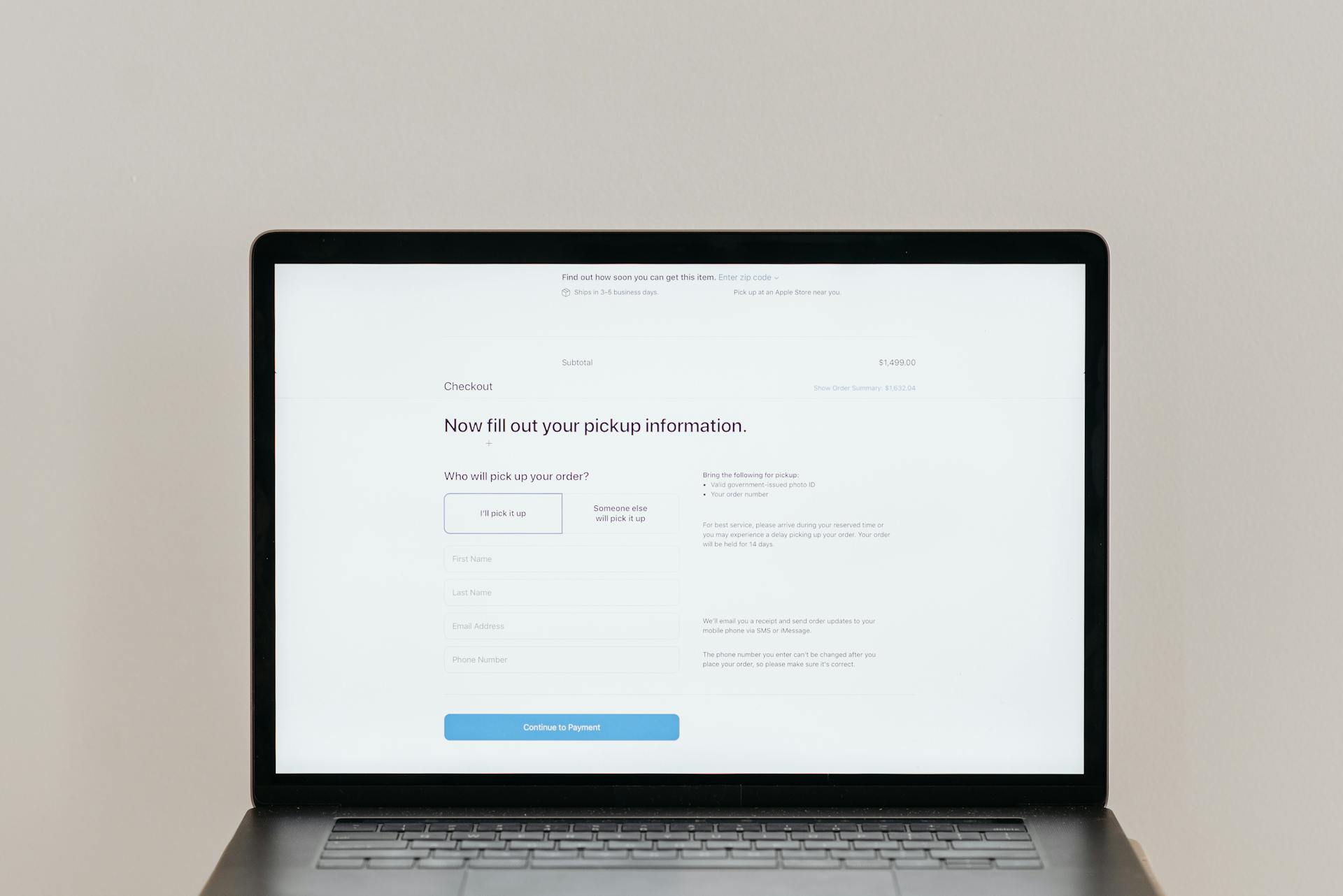
In this guide, you’ll learn which Shopify product page trust signals actually move the needle, where to place them for maximum impact, and how to implement them without cluttering your design.
What Are Shopify Product Page Trust Signals?
Shopify product page trust signals are visible elements that reduce uncertainty and prove legitimacy at the exact moment a customer is deciding whether to buy.
In ecommerce, trust signals include customer reviews, secure payment icons, clear shipping timelines, return policies, guarantees, and real user photos—anything that answers the silent question in a buyer’s mind: “Is this safe, and will I get what I expect?”
On Shopify stores, these signals matter even more because many stores use similar themes and layouts, which means shoppers cannot rely on brand recognition alone to judge credibility.
Unlike large marketplaces, independent Shopify stores must earn trust within seconds, often from cold traffic coming from ads or social media.
That first impression determines whether a visitor explores further or exits.
The psychology is simple but powerful: online buyers feel risk because they cannot touch the product, speak to a salesperson, or instantly verify the company behind the site.
That uncertainty creates hesitation. Hesitation lowers conversion rate.
Trust signals work by reducing perceived risk, increasing perceived value, and giving the brain enough reassurance to move forward.
When implemented correctly, they shift the decision from doubt to confidence, and that shift is what turns traffic into revenue.
Why Trust Signals Increase Conversions
Reducing Purchase Anxiety
Every online purchase carries risk. Customers cannot touch the product, test it, or speak to someone face-to-face. That gap creates anxiety, especially for first-time buyers.
Trust signals reduce that anxiety by replacing uncertainty with clarity.
Clear shipping timelines answer “When will I get it?” Transparent return policies answer “What if it doesn’t work?” Visible reviews answer “Will this actually deliver on its promise?” When these concerns are addressed directly on the product page, the brain processes less risk.
Less risk leads to faster decisions. Practically, this means placing guarantees near the Add to Cart button, showing delivery estimates above the fold, and displaying authentic reviews with real customer photos.
The goal is simple: remove doubt before it grows.
Overcoming Objections Before Checkout
Most abandoned carts are not random. They are the result of unanswered objections.
Customers question price, quality, delivery speed, and refund security long before they reach checkout. Strong trust signals handle these objections early.
A money-back guarantee counters fear of loss. A “free returns” message neutralizes hesitation. Detailed FAQs eliminate confusion around sizing, usage, or compatibility.
When objections are resolved on the product page, fewer buyers drop off later in the funnel. Implementation matters here.
Instead of hiding policies in the footer, surface them near decision points. Use concise bullet points. Be specific. If shipping takes 5–7 days, say it clearly.
Improving Perceived Legitimacy
Visitors decide within seconds whether a store feels real. Clean design helps, but proof builds legitimacy.
Reviews with timestamps, verified buyer badges, press mentions, and secure payment icons signal that the business operates professionally.
On Shopify, where many stores look similar, these markers become credibility shortcuts. Without them, even a strong product can feel risky.
With them, the store appears established and reliable. Place star ratings under the product title. Add secure checkout messaging near the payment section.
If you have media features or certifications, display them strategically and not aggressively, but confidently.
Supporting Higher Price Points
Trust directly influences price tolerance. When risk feels high, customers become price sensitive. When trust feels strong, value perception increases.
This is why premium brands invest heavily in social proof and guarantees. Detailed reviews justify quality. Clear policies justify commitment.
Strong brand messaging reinforces confidence. Together, these signals allow customers to focus on benefits instead of fear.
If you want to raise prices without hurting conversion rate, strengthen trust first.
Add depth to product descriptions. Show real outcomes. Reinforce security and support.
When confidence rises, resistance falls—and higher price points become sustainable.
Core Shopify Product Page Trust Signals (Must-Have)
1. Customer Reviews & Ratings
Customer reviews are the most powerful trust asset on a Shopify product page because they provide independent validation. Shoppers trust other buyers more than brand claims.
A visible star rating placed directly under the product title immediately signals proof. It reduces friction before the visitor even reads the description.
This placement works because it anchors perception early. If a product shows 4.7 stars from 300 reviews, confidence increases within seconds.
Photo and video reviews strengthen that effect. Text reviews tell. Visual reviews prove.
When customers upload real images or short clips, they demonstrate real-world usage and outcomes.
This reduces perceived risk and answers unspoken questions about quality, size, color accuracy, or performance.
Encourage this by emailing customers after delivery and offering simple upload prompts within the review form.
Verified buyer badges add another layer of credibility. They show the review came from an actual purchaser, not random feedback.
This small visual marker increases perceived authenticity. On Shopify, review apps can automatically tag verified purchases through order data. Use that feature. It prevents skepticism.
To collect reviews consistently, automate the process. Set up post-purchase email flows that request feedback 7–14 days after delivery. Keep the form simple. Ask for a rating first, then optional details, then photos.
The easier it is, the more responses you receive. Volume matters, but authenticity matters more. Never fabricate reviews. Long-term trust always outweighs short-term appearance.
2. Secure Payment Icons
Payment icons signal transactional safety. When shoppers see familiar logos like Visa, Mastercard, or PayPal, they associate your store with established financial systems.
That association lowers risk perception instantly. It communicates that payments are processed through recognized providers, not unknown channels.
SSL badges reinforce that security message. They indicate encrypted transactions and data protection.
While many customers do not fully understand SSL technology, they recognize the symbol as a security marker.
Placement determines effectiveness. Payment icons should appear near the Add to Cart button or directly below it. They can also be repeated near the checkout section.
Avoid cluttering the page with oversized graphics. Keep them clean, aligned, and subtle.
3. Clear Shipping Information
Shipping uncertainty is one of the biggest conversion killers. If customers do not know when a product will arrive, they delay the purchase. Clear delivery timeframes solve this.
Instead of vague phrases like “fast shipping,” state specific estimates such as “Delivers in 5–7 business days.” Specificity builds trust.
Shipping costs must also be transparent. Hidden fees discovered at checkout increase abandonment rates. If shipping is free, say it clearly near the price or the Add to Cart button.
If it is calculated at checkout, communicate that early. Surprises damage trust.
Tracking details complete the reassurance loop. Inform customers that tracking numbers will be provided after shipment. This shows operational structure.
Practical implementation is simple: include a short shipping summary section on the product page with bullet points covering timeframe, cost, and tracking.
4. Easy Return & Refund Policy
A clear return window reduces purchase hesitation. When customers know they have 30 days to return an item, perceived risk drops. The decision feels reversible. Reversibility increases willingness to buy.
Hassle-free messaging strengthens this effect. Phrases like “No questions asked returns” or “Easy exchanges” communicate confidence in the product.
The tone should be firm and simple, not defensive. Avoid complicated legal language on the product page.
Linking to the full policy maintains transparency. Include a short summary near the Add to Cart button, then provide a link to detailed terms.
This structure balances clarity with completeness. Customers who need reassurance can click through. Others move forward without friction.
5. Money-Back Guarantee
A money-back guarantee is a direct risk reversal. It shifts responsibility from the buyer to the seller.
Psychologically, this reduces loss aversion, which is one of the strongest decision barriers in ecommerce. When customers feel protected, resistance decreases.
Presentation matters. The guarantee should be concise and benefit-focused. For example: “30-Day Money-Back Guarantee.
If you’re not satisfied, get a full refund.” Place it close to the Add to Cart button or near pricing. It should reinforce the purchase decision, not sit hidden in the footer.
Design it with clarity. Use a small icon or badge, but avoid exaggerated claims. The message must feel credible. A realistic, clearly defined guarantee builds long-term trust and strengthens brand authority.
Advanced Trust Signals That Increase AOV
1. User-Generated Content (UGC)
User-generated content strengthens belief because it shifts the narrative from brand-controlled messaging to customer-led validation.
When shoppers see real people using the product, perceived authenticity increases. This does more than build trust. It expands perceived value.
Buyers begin to visualize themselves using the product, which supports a higher average order value (AOV) through bundles or premium variants.
Customer photos are especially effective. They show scale, context, and real-life results. Studio images communicate quality. Customer images communicate reality.
Both are necessary. Feature UGC directly under the product gallery or within the review section. Keep it organized and easy to scroll.
Instagram feed integration extends this proof. When visitors see tagged posts from real accounts, it signals active community engagement. It also implies brand longevity.
Embed a curated feed below the product description or within a dedicated “In Real Life” section. Ensure the content is relevant to the product.
Random lifestyle images dilute the impact. Strategic curation strengthens credibility and perceived desirability.
2. Social Proof Counters
Social proof counters create urgency through visible activity. When customers see “32 sold in the last 24 hours,” they interpret demand.
Demand implies value. Value reduces doubt. This psychological shortcut supports faster decisions and higher basket sizes.
“X people viewing now” adds momentum. It signals live interest. The buyer no longer feels alone in the decision.
However, accuracy is critical. False counters erode trust quickly if exposed. Use tools that pull real data or display conservative estimates.
Position counters near the Add to Cart button so they reinforce action without distracting from it.
Moderation matters. Subtle movement influences behavior. Overly aggressive pop-ups can feel manipulative. Keep the message simple and consistent with the brand tone.
Done correctly, social proof increases both conversion rate and AOV by validating product demand.
3. Trust Badges (Use Carefully)
Trust badges can reinforce security and guarantees, but only when used strategically.
Minimal, recognizable icons placed near checkout or guarantee messaging enhance reassurance. They should align with real policies and real protections. Authenticity is non-negotiable.
What works is clean design and relevance. A small “Secure Checkout” badge next to payment icons makes sense. A “30-Day Guarantee” badge near the price reinforces commitment. These elements support decision confidence.
What looks spammy is excessive decoration. Large, brightly colored badges stacked under the Add to Cart button create skepticism.
Unknown logos with vague claims damage credibility. If a badge feels promotional instead of protective, remove it.
4. Press Mentions & Certifications
Press mentions elevate brand authority by signaling third-party validation. An “As seen in” section shows that external platforms recognize the brand.
This reduces perceived startup risk and increases perceived stability. Even small media features can strengthen legitimacy when presented professionally.
Placement should be deliberate. Add a clean logo strip below the product description or near the footer of the product page. Avoid exaggeration.
If the feature was a blog mention, present it accurately. Transparency preserves credibility.
Industry certifications operate differently. They signal compliance, safety, or quality standards.
For products in health, beauty, or technical categories, certifications can significantly increase price tolerance.
Display certification logos with short explanations of what they mean. Do not assume customers understand them.
Advanced trust signals work because they extend validation beyond the brand itself.
They create layered credibility. When layered correctly, they not only improve conversions but also justify higher cart values with confidence.
Trust Signals in Key Product Page Sections
Trust signals are not just about what you add. They are about where you place them. Positioning determines visibility, and visibility determines impact.
Below is how to structure them for maximum conversion lift.
Above the Fold
This is the first screen a visitor sees. Decisions begin here. If trust is not established immediately, hesitation starts.
Star Rating Placement
Place the star rating directly under the product title. This anchors perception before the visitor reads features or pricing.
A strong rating with a visible review count signals proven demand. Make it clickable so users can jump to reviews. Visibility and accessibility increase engagement.
Free Shipping Message
If you offer free shipping, display it near the price or under the Add to Cart button. “Free Shipping” reduces perceived total cost immediately.
If shipping has conditions, state them clearly. Specific thresholds like “Free Shipping on Orders Over $50” remove uncertainty and prevent later friction.
Guarantee Snippet
Add a short guarantee statement close to the buying decision. For example: “30-Day Money-Back Guarantee.” Keep it concise. The goal is reassurance, not explanation.
The detailed policy can sit below, but the snippet must be visible early to reduce risk perception.
Product Description Area
This section builds logical justification after emotional interest is triggered above the fold. It must deepen trust, not overwhelm.
FAQs
Include product-specific FAQs directly within the page, not only in a separate help center.
Address common concerns such as sizing, compatibility, usage instructions, or delivery timelines.
Each answered question removes a potential exit point. Structure FAQs in expandable sections for clarity without clutter.
Detailed Specs
Clear specifications demonstrate transparency. List materials, dimensions, weight, compatibility details, or performance metrics where relevant.
Specificity signals professionalism. Vague descriptions create doubt. The more technical the product, the more detailed this section should be.
Transparency Elements
Explain manufacturing location, materials sourcing, or testing standards if applicable. Add realistic product timelines. Show honest limitations where necessary.
Transparency increases credibility because it shows confidence. When brands acknowledge details openly, trust strengthens.
Add-to-Cart Section
This is the decision zone. Any remaining hesitation must be neutralized here.
Secure Checkout Messaging
Place secure payment icons and a short message such as “Secure Encrypted Checkout” directly below the Add to Cart button.
This reinforces safety at the exact moment payment is considered. Keep icons clean and minimal. Overuse reduces impact.
Risk Reversal Reminders
Repeat the strongest reassurance near the button. This could be a money-back guarantee, free returns, or satisfaction promise.
Short reminders are powerful because they reduce loss aversion right before commitment. Position them clearly but subtly.
Shopify Apps That Help Add Trust Signals
Review Apps
Review apps automate the collection, display, and verification of customer feedback. They connect directly to order data, which allows you to request reviews only from verified buyers.
This protects authenticity. Automation ensures consistency, which builds volume over time.
The key features to prioritize are automated post-purchase emails, photo and video uploads, star rating display under product titles, and filtering options.
Rich snippets for SEO are also valuable because they allow star ratings to appear in search results, increasing credibility before users even visit your store.
Placement matters. Reviews should appear below the product summary and be accessible through a clickable star rating above the fold.
Avoid hiding them in separate tabs that reduce visibility. High-quality review apps allow customization so the design aligns with your brand. Integration should feel native, not added.
UGC Apps
User-generated content apps extend social proof beyond written reviews. They pull customer photos from submissions or social platforms and display them directly on product pages.
This reinforces real-world usage and builds lifestyle context around the product.
Look for apps that allow shoppable galleries. When customers can click on a photo and go directly to the product, engagement increases, and friction decreases.
Moderation tools are essential. You want control over what appears publicly to maintain quality and brand alignment.
Integration should be strategic. Add UGC sections below product descriptions or between reviews and related products. Avoid overwhelming the top section of the page.
The goal is reinforcement, not distraction. Strong UGC increases both trust and perceived desirability, which supports higher AOV.
Guarantee/Badge Apps
Guarantee and badge apps help visually reinforce security, policies, and risk reversal.
They allow you to add clean icons such as “Secure Checkout,” “Money-Back Guarantee,” or “Free Returns” near decision points.
These visual cues work because they simplify reassurance into quick, recognizable signals.
However, restraint is critical. Choose apps that offer minimal, customizable designs rather than flashy templates. Excessive or exaggerated badges reduce credibility.
Focus on relevance. If you offer a 30-day return policy, display that. If you provide secure payment processing, reinforce it subtly near the Add to Cart button.
Position badges directly under primary action buttons or near pricing details. They should support the buying decision without interrupting it.
FAQ Apps
FAQ apps centralize common objections and make them easily accessible within the product page.
They allow collapsible sections that keep the layout clean while delivering detailed answers.
This reduces friction for buyers who need additional reassurance before committing.
The most effective FAQ apps allow product-specific questions, not just general store-wide responses. Each product has unique concerns.
Address them directly. Include shipping details, compatibility, care instructions, warranty coverage, and return timelines where relevant.
Searchable FAQs add another layer of usability for larger catalogs. The easier it is for customers to find answers, the lower the hesitation.
Integrate FAQs directly below the product description or near the bottom of the page. They should feel like part of the buying journey, not a separate support document.
Common Mistakes That Kill Trust
- Fake-looking badges – Overdesigned or exaggerated trust icons make your store feel unprofessional and reduce credibility instantly.
- No reviews on new stores – A product page without reviews signals a lack of validation and increases hesitation for first-time buyers.
- Hidden shipping costs – Unexpected fees at checkout break trust and significantly increase cart abandonment.
- Overcrowded product pages – Too many competing elements create confusion, weaken clarity, and slow down buying decisions.
How to Test Trust Signals for Higher Conversions
Adding trust signals is not enough; you must measure their impact. A/B testing is the foundation.
It works by comparing two versions of the same product page—one with a specific trust element added, removed, or repositioned, and one without the change—to determine which performs better.
Test one variable at a time, such as moving reviews above the fold or adding a guarantee near the Add to Cart button, so you can isolate cause and effect.
Run tests long enough to reach statistical significance; short tests produce misleading conclusions. Focus on high-traffic products first to gather reliable data faster.
Track metrics that directly reflect buying intent: conversion rate is primary, but also monitor add-to-cart rate, checkout initiation rate, and revenue per visitor.
If a trust signal increases add-to-carts but not completed purchases, friction may still exist later in the funnel. Look beyond surface metrics.
Measure average order value to see if enhanced trust supports premium pricing or bundles.
Use heatmaps to observe where users click, scroll, and hesitate; if visitors repeatedly hover near shipping details, that area may require clearer messaging.
Session recordings add context by revealing behavioral patterns such as rapid scrolling, repeated page refreshes, or abandonment after viewing policies.
These insights expose friction that analytics alone cannot show. Testing trust signals is a continuous process. Implement deliberately, measure objectively, and refine consistently.
Shopify Product Page Trust Signal Checklist
Quick Actionable Checklist
- Star rating visible directly under the product title
- Clickable reviews with real customer photos or videos
- Verified buyer indicators enabled
- Clear delivery timeframe shown near the price
- Shipping cost stated upfront (or “Free Shipping” clearly displayed)
- Secure payment icons are placed near the Add to Cart button
- Short money-back or return guarantee snippet visible
- Easy-to-scan return policy summary on the product page
- Product-specific FAQs addressing top objections
- Clean layout with no excessive or spam-like badges
What to Fix Today
- Move reviews above the fold if they are hidden
- Add clear shipping timelines if currently vague
- Remove fake or overly decorative trust badges
- Insert a concise guarantee near the Add to Cart button
- Clarify the return window in one simple sentence
What to Improve Over Time
- Increase review volume through automated post-purchase emails
- Encourage photo and video submissions from customers
- Refine FAQs based on real support questions
- Test placement of guarantees and security messaging
- Analyze conversion data monthly to optimize trust signal positioning
Final Thoughts
Trust is not created by one badge or one review. It is built in layers across the entire product page. Each clear detail, visible proof point, and honest policy reduces hesitation step by step.
Small signals compound. A star rating above the fold, a clear delivery estimate, and a simple guarantee can produce measurable lifts in conversion rate.
The impact often comes from positioning and clarity, not complexity.
Start with the fundamentals. Add the essential trust signals. Then test, refine, and improve based on real data. Conversions increase when confidence increases.
FAQs
What are the most important trust signals on Shopify?
Customer reviews, clear shipping information, a visible return policy, secure payment icons, and a concise money-back guarantee have the strongest impact on conversion rate.
Where should trust badges be placed?
Place them near decision points, especially below the Add to Cart button or near pricing, where they reinforce security at the moment of commitment.
Do trust badges actually increase conversion rate?
Yes, when they reflect real policies and are positioned correctly, they reduce perceived risk and support faster buying decisions.
How many reviews should a product have?
There is no fixed number, but even 5–10 authentic reviews are better than none, and higher volume with consistent ratings increases credibility further.
Should new Shopify stores add trust badges?
Yes, but only badges that represent real protections like secure checkout or a genuine return policy; credibility comes from accuracy, not decoration.

Ethan Caldwell is a Shopify conversion optimization researcher who focuses on structured testing frameworks, product page improvements, and data-driven eCommerce performance strategies. His work emphasizes practical implementation and long-term store optimization rather than quick-fix tactics.